test
1

Hello.
I hope the navigation of my work gives you ease of use. My news feed is quite erratic and in no particular order (I don’t have control over this) so I’ve created sub headings in the menu to help steer you in the right direction.
My assignments have been in part reworked based on tutor comments however, the first drafts have been overwritten. I wasn’t aware of this until I tried to add them to the menu too. I can only apologise for this.
Thank you
Sam Bennett
There aren’t any exercises in Part Five of People and Place.
I’ve been looking at the work of Annie Leibowitz and American portrait photographer, who puts a great emphasis on the way her subjects are posed. What I learned from her is to open up the boundaries. Her photograph of John Lennon and Yoko in bed, taken on the day John Lennon was shot, is posed in such a way you get the feeling of how much they love each other. Yoko is lying flat in a vulnerable position with her hair training straight up as if to give the impression she is being pulled. John Lennon has his naked body so tightly wrapped around her as if he’s trying to cling on and prevent her being pulled away from him. This makes John the more vulnerable of the two, you can feel his desperation to hold on to Yoko.

Another one of Annie Leibowitz photographs that caught my eye is Arnold Schwarzenegger sitting on his horse which a cigar in his mouth. As if his muscles weren’t dramatic enough some quiet harsh lighting was using directed straight as the face of the horse.

The horse is even looking down as if it’s all too much but the shadows cast are add an interesting feel to the photograph overall. I like that Arnold’s face and arm is light up perfectly with a little bit of a tease of muscle on the side. His back and other arm is then completely in shadow and adds definition and depth to the photograph.
In Part One of People and Place, I carried out a variety of exercises based on Portrait photography. The elements covered within this are:
Framing – How to frame your subject, face, face and shoulders, full body etc.
Backgrounds – Looking at different backgrounds to get different styles.
Light – How light impacts on the mood of the photograph and how this can be manipulated.
Activity – Portraits showing your subject during an activity.
Context – How objects are placed with the subject to give a narrative.
Expression – Showing the different expressions with the face of your subject.
Eye Contact – Engaging the subject.
Focal Length – How longer focal lengths give more flattering features.
Pose – Successfully posing your subject to look natural.
This assignment is based around these elements and showing how they are used when photographing people. The following set of six photographs show different elements of portraiture and I will give an example of what I have particularly focussed on for each image.
Pose
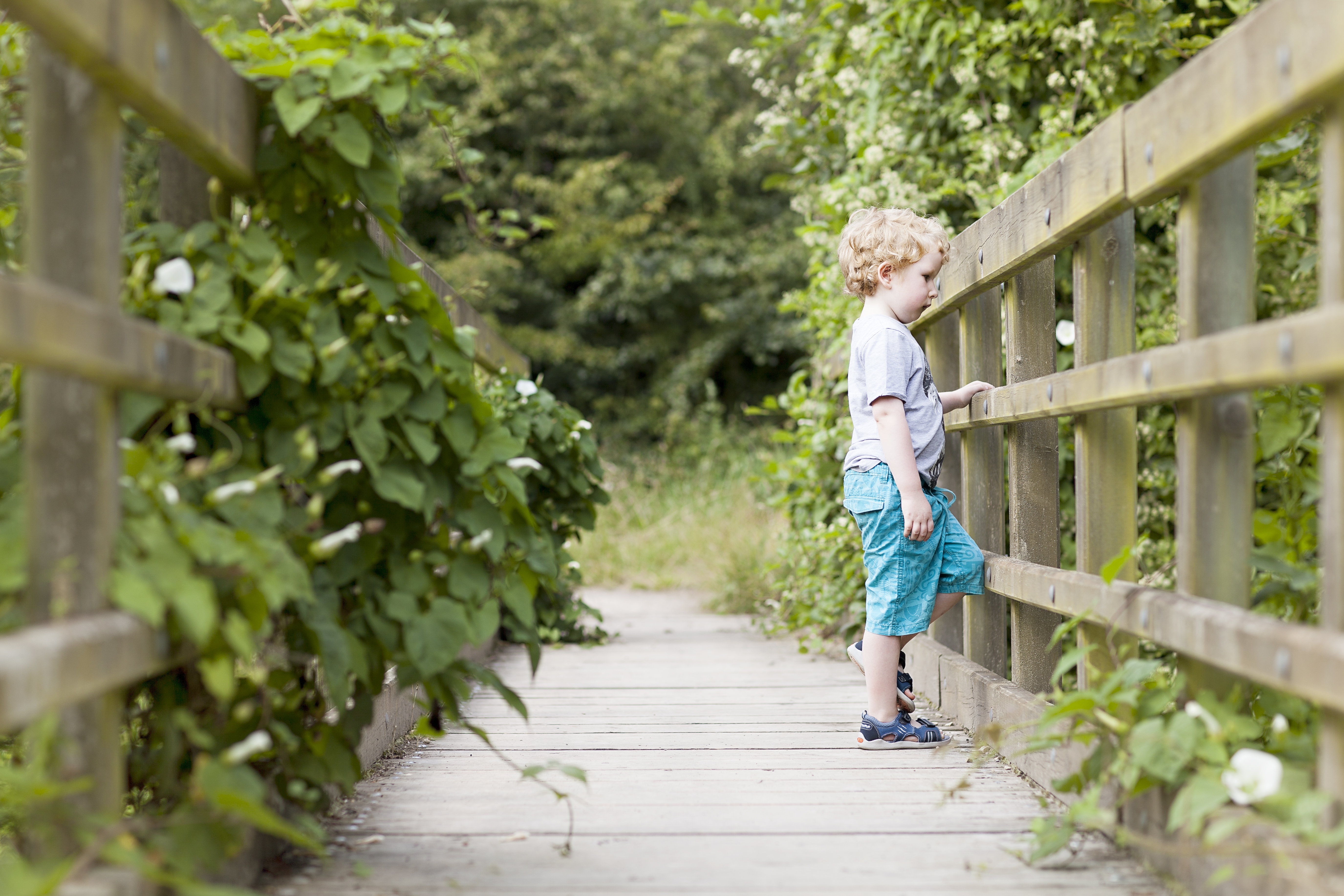
Here I wanted the subject to looked natural and relaxed. He’s clearly looking down at what is beneath the bridge so his head is posed naturally towards the view. His eyes are focussed on the view too. To make this a more natural pose I asked my subject to raise one foot onto the wooden bar and put one hand on another wooden bar. His hand looked nicely posed but the foot looked forced and awkward so I asked my subject to place his foot where it felt comfortable for him whilst raising his knee. This is the resulting image. What I like about this photograph is the symmetry of the bridge and how the path leads you into the photo. The foliage on the left balances out the subject. I wish I’d have given more thought to the colours my subject was wearing just to stand out a little more. Maybe a contrasting colour to green could have been used.
Eye Contact

I do question whether this composition is a good one or not. In all honesty, I’m still undecided but there is something very natural about this photograph. The colours of Autumn are striking against the deep blue of the clothing which also compliments the eyes. Every time I look at this photo I’m drawn to the eyes as they are focussed on the camera looking straight down the lens. This is difficult to achieve with a five-year old!
When looking at the above photograph where I’m not sure if the pose is good or not I think I’ve just pushed the boundaries of what I’ve previously been taught is a good composition. I aim to become more comfortable with asking my subjects if I photograph them in ways that aren’t traditional.
Activity
 I carried out a photo walk with my subject asking them to photograph what they saw and liked. He stopped to take a photograph of a puddle when I saw a reflection of him with a tree in the background and I thought it looked great. Whilst he was engrossed in his activity I took a photograph of his reflection. Although you can’t see much of his face I’m not shy of excluding faces from photographs. In fact this is my next personal project. So, that doesn’t bother me, its whether you can see that he’s taking photographs and carrying out an activity that I’m not sure of. I know he’s taking photos and my brain tells me that he has a camera in his hand but I’m not sure it’s clear to people who don’t know. I also like the colouring that’s reflected back, especially the blue of the sky.
Background

When I saw this background I was über excited. It was so colourful yet uniformed enough to not be distracting. I asked my subject to walk along gazing at the books on the shelf. Was thinking his burgundy trousers would really pick out the deep reds of the books and he would stand out amongst the other colours going on. He did have a rather impressive large dinosaur book in his hand which made his prop relevant to the scene. Now I’m reviewing this photograph I think that the subject doesn’t stand out enough. It may be because of the book he’s carrying is covering his legs and those burgundy trousers which were meant to be a feature. Maybe I should have removed his coat because its merges in with the wooden bookcase too much. Either way my initial excitement has been dampened and I’m yet to revisit Hay on Wye to try this out again.
Framing

This photograph is about where my subject is placed in relation to the surrounding to form a narrative. If I’d have cropped in closer giving more detail of my subject I would have lost the narrative. With a wider framing we can see ‘Superman’ is running along a path, under foliage growing around arches to form a tunnel. This makes the activity more exciting. I purposely chose contrasting colours to make my subject stand out more from the background……a lesson learnt from the previous photograph!
Context

This photograph has a few important elements for me. The lighting for one, is giving the face and body that boost it needs especially when your subject is wearing a hat. The time of day this was taken is important to the success of this photograph. It’s early evening and the sun is low in the sky allowing a burst of side light to my subject and casting long shadows. The reason I have put emphasis on context here is by including the line of umbrellas along the shore line. I think it’s clear we’re on a beach but my subject is walking away from the shore line indicating that it’s the end of the day and were heading home. I also love the way my subject is holding his sandals in one hand and looking down as if to tread carefully.
Light

I love light. I know, as a photographer I should love light but it really excites me. I’m always thinking of different ways to use light and using different light sources. In this photograph, my subject is watching a film on his iPad. It was dark outside and we had a lamp on in the lounge. I saw the light radiating on his face and told him to hold his pose. I switched off all the lights and there it was. It lit his face up beautifully. Again, I don’t buy into ‘you should be able to see your subjects eyes’, I mean why if he’s looking at something else!
I’ve been looking at the work of Annie Leibowitz and American portrait photographer, who puts a great emphasis on the way her subjects are posed. What I learned from her is to open up the boundaries. Her photograph of John Lennon and Yoko in bed, taken on the day John Lennon was shot, is posed in such a way you get the feeling of how much they love each other. Yoko is lying flat in a vulnerable position with her hair training straight up as if to give the impression she is being pulled. John Lennon has his naked body so tightly wrapped around her as if he’s trying to cling on and prevent her being pulled away from him. This makes John the more vulnerable of the two, you can feel his desperation to hold on to Yoko.
Another one of Annie Leibowitz photographs that caught my eye is Arnold Schwarzenegger sitting on his horse which a cigar in his mouth. As if his muscles weren’t dramatic enough some quiet harsh lighting was using directed straight as the face of the horse.
The horse is even looking down as if it’s all too much but the shadows cast are add an interesting feel to the photograph overall. I like that Arnold’s face and arm is light up perfectly with a little bit of a tease of muscle on the side. His back and other arm is then completely in shadow and adds definition and depth to the photograph.
In conclusion a good photograph will include some of the above elements but a great photograph will have considered all of the above.
My objective for this assignment is to identify five or six buildings and produce two to four images for each one. The main focus is in describing effectively and attractively the way in which these spaces are used.
The first task I undertook was to choose which buildings I would use. I was looking for variety of different types of buildings and differing uses for the spaces contained within them.
My selection are as follows:
I wanted to photograph a library as my sixth selection but it was unexpectedly closed on the day I visited. I phoned the library to ask if photography was allowed but they said because children are normally present it wouldn’t be appropriate. For this reason I have kept my selection to five buildings so I can concentrate on them.
I devised a plan on how to achieve my objectives which can be found in my learning log:
https://wordpress.com/post/samjbennett.wordpress.com/1245
I will include some background information about each building and whether it is still used for its original purpose or not. I will also discuss whether, in my opinion, the space is effective as a usable space.
New Cinema
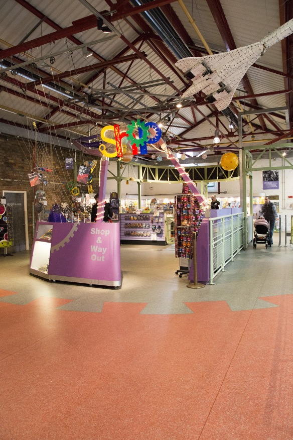
This cinema forms part of a new development in Telford, Southwater, which contains restaurants, bars and leisure facilities. The cinema is situated at the end of a row with it’s screens sitting above its adjoining restaurants. As a whole and in terms of the development this is a very efficient use of the space. As a cinema, the main foyer and the lobby are contained in what appears to be their own building with the screens leading off to one side. You don’t feel like you’re sitting above a restaurant, its simply an extension of the cinema itself.
My initial thoughts for photographing the cinema were to include the foyer, with ticket machines in view, the popcorn counter, the row of screen doors and view of the screen from the back of the cinema. This would encompass the complete ‘cinema experience’ within the allowed four photographs.
Then I thought more about the space within the cinema and how its used effectively which lead to my second arrangement which shows the flow of the space inside the cinema.
The foyer is quite a vast area that I wasn’t able to fit into one photograph so I decided to take two images from two different angle to show the different elements, photo 1 and photo 2. All the photographs here were taken at a standing position as this is the area you would walk through.
Photo 1
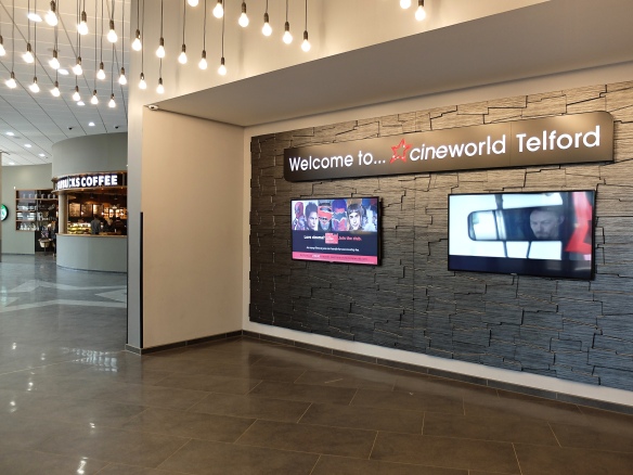
Photo 2

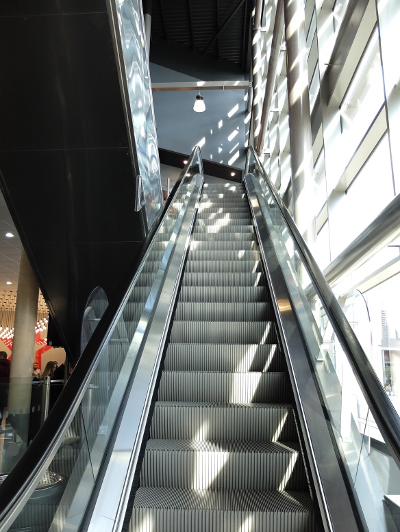
In the next photograph, photo 3 I wanted to describe two things, one being the suggestion of the space being on two levels and two, the amount of light that floods in from the incredibly tall windows. I also like this photograph asthetically with its leading lines, the scale of the height and the light making a pattern on the wall.
Photo 3
Photograph four shows the use of the space upstairs as the main lobby of the cinema, where snacks are purchased prior to moving on to your screen. I wasn’t allowed beyond this point, in fact from this point on, I wasn’t allowed to take any more photos.
Photo 4

Despite my shoot being cut short I think I captured the main uses of the space inside the cinema. Some elements of my final selected images I would do again, for instance, the little boy in the corner of photograph 4 is looking up at the animation but he appears to be looking out of the frame which is quite distracting.
In photos one and two I can’t decide if the tungsten light is unattractive or not. It’s a personal pet hate of mine although it seems to add some warmth in this situation which I feel is important to the space. Otherwise it appears quite cold with its steel structure and marble floors.
In terms of the space being effective I think in this case it works very well. The space is open and vast but defined by its uses. Where the foyer and main lobby is in it’s own building the rest of the cinema i.e. the screens are situated above the surrounding restaurants. It’s a clever way of ulitising the space available effectively and was designed to do exactly that. The design allows for lots of light to flood in exactly where it’s needed which also makes the space efficient.
The Church
Our local church is quite picturesque, sitting at the top of a hill. I’m told churches were designed to be built on hills in those days so the villagers can see the clock and hear the bells easier from their houses. Another reason for building a church on a hill is it was beleived that you should bury your loved ones up high to be closer to god. However in this case the village sits on a flood plane which is no good for burials and therefore the cemetery needed to be up high so the church was built up the hill. If so much thought went into the outside space of the church then it stands to reason the the inside was lavished with the same consideration.
Holy Trinity Church in Coalbrookdale was built by the famous local Darby family and was completed in 1854. The Darby family came from generations of quakers but Abraham Darby IV left the Quaker belief behind for the more modern Anglican beliefs and donated money to the town to construct the church.
As churches are no longer left unlocked I found the contact details for the church warden and arranged to meet her there.
The usable space inside the church is as elaborate as the exterior of the building. The first sight upon entering the church is quite grand with a long aisle to walk down which is where you can also access the pews. I chose my viewpoints based on the flow of its users, almost like a walk through.
Photo 1
 The aisle leads you directly to the church alter with its stunning stained glass window in full view. The design of space inside the church is not only effective, it allows for incredibly beautiful views. This photograph was taken from a standing position as the user would be walking from this viewpoint.
Photo 2
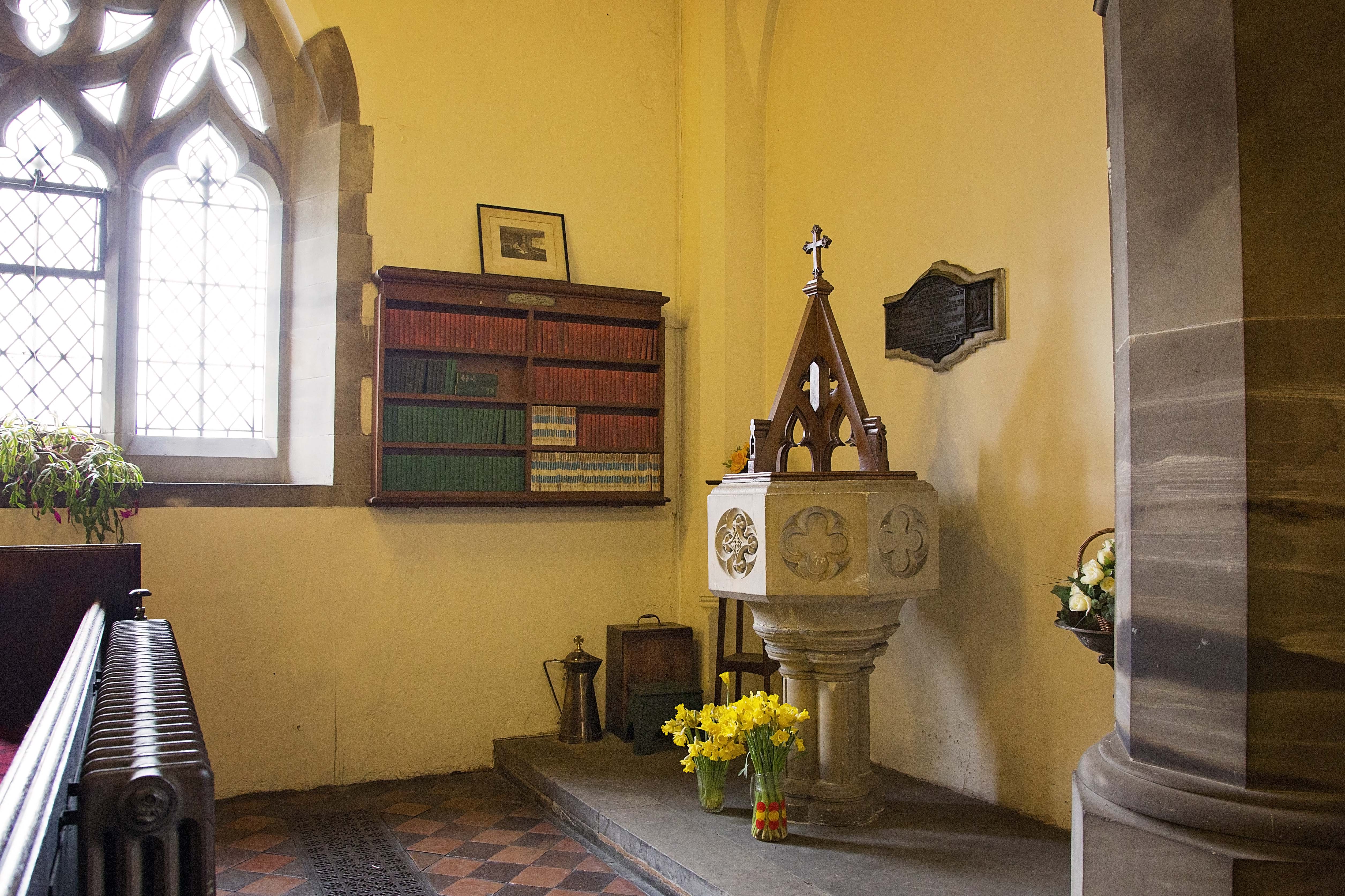
Photograph 2 shows a different part of the church which has a specific function for Christening services. I’ve also included the shelving where the hymn books and bibles are stored, a pinnacle part of the church story. I like this viewpoint as it included one of the impressive stone pillars and a very ornately designed window. Using a wide angle lens to obtain as much narrative as within a single frame has resulting in some distortion. Notice how the stone pillar bends round towards the top of the frame.
Photograph 3 shows a view of the approach to the alter from a standing position. I thought it was important to show a more detailed view of the alter as it is arguably the most important space in the church. We know this because of the elaborate stained glass window being the central point of focus with the alter sitting beneath it.
Photo 3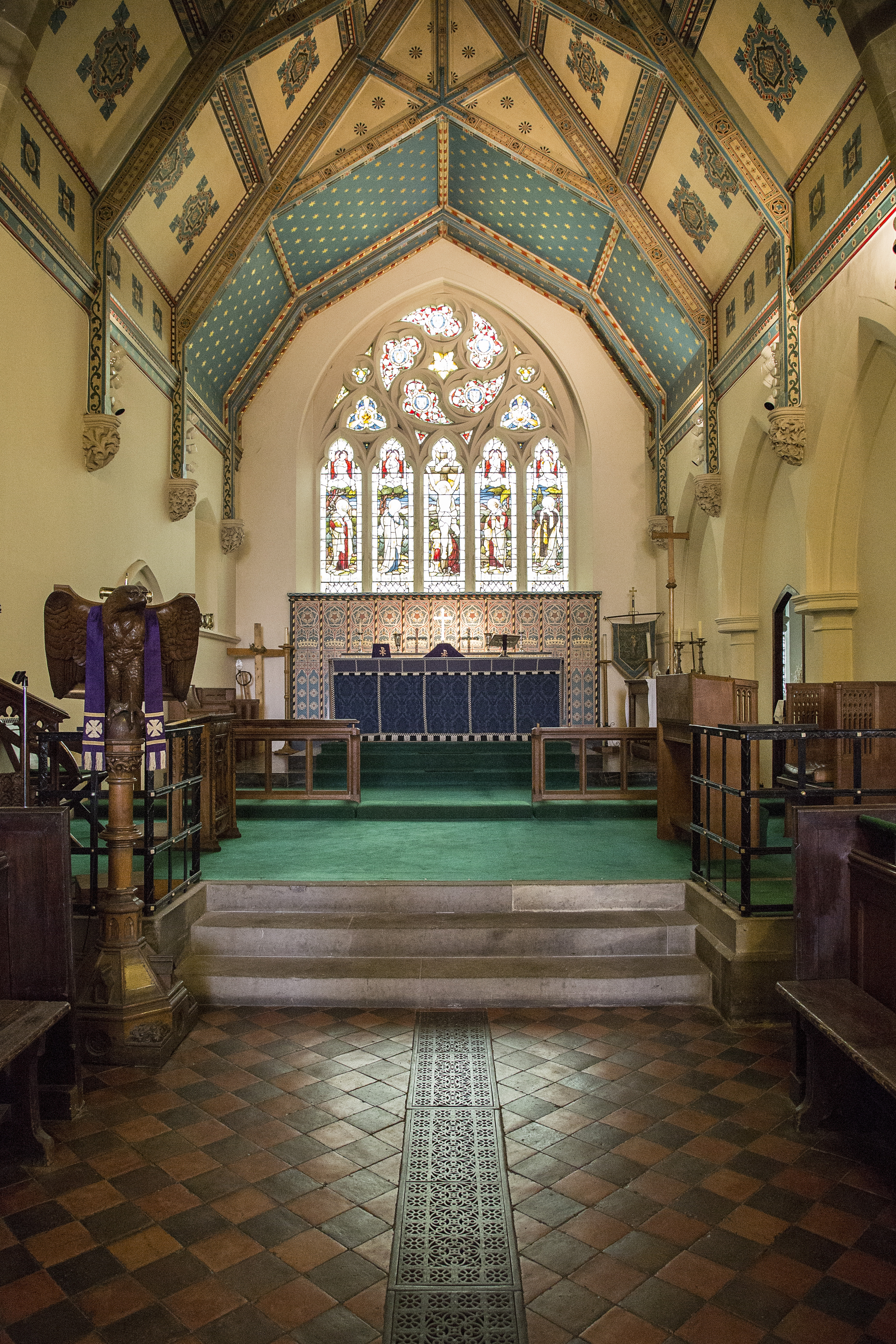
The reason for choosing this viewpoint is to include the steps up to the alter and how this is a great use of the space by elevating ‘the main event’ so the users maintain a good view. Also notice the beautiful ceiling which has a story of its own and detailed in my learning log.
Photo 4

Photograph 4 shows the fund raising side to the church. Although not a particularly attractive view it does show the ‘make do’ nature of the church wardens with this makeshift table. I like how this attitude to money saving is further accentuated with the donation box and sale of craft items. This viewpoint includes the church windows and pews in the background so the viewer knows where donations are being sought and what for.
In my opinion the use of this space works on so many levels, many already mentioned. The thought that has gone into the function of the space, how it can be fully utilised and the decorative quality; has been repaid in the fact this space is still used for its original purpose almost 160 years on without being changed.
So the previous two buildings were a contrast between old and new however both are still being used for their original intended use. The next building has changed it’s use several times and is currently a deli\cafe.
The Deli
The building was originally built as a ‘tuck shop’ which acted as a local newsagents come grocery store. The building was originally built from timber but due to severe flooding a brick building was erected to replace the damaged timber building. The brick building has been subjected to two severe floods since, one reaching the top of the front door. The damage was repaired and was reopened as a deli.
So, the building itself wasn’t built for a specific use however it was built to provide a space for a use to fit into.
Following my previous method of obtaining a description of the use of the space I achieved this by following the walkthrough of the user experience.
Photograph 1 shows the view on entry into the building and the customers first glance.
Photo 1
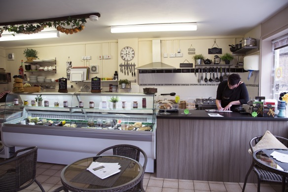
My first thought when entering this building was how do I make this space look attractive? Therefore I focussed photograph 1 on the main counter and cut out the more distracting items from the frame; such as, a tall fridge to the right and toilet to the right. If I want to make a space that food themed appear attractive then I don’t want a toilet door on view.
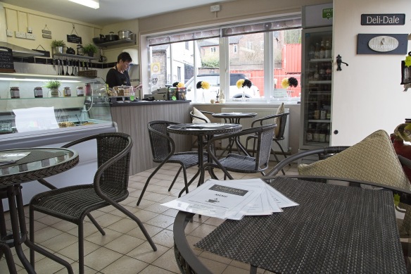
Photo 2

Photograph 2 shows a typical seating setup and the space around it which is limited. I think it’s important to point out the addition of the seating area outside that can be seen too. It shows that the space has been setup as a compromise between space for items for sale and space for enjoying purchases when considering its in a small space is a good way of utilising the space efficiently.
Photo 3
Photograph 3 is to demonstrate the viewpoint of the customer from a seated perspective. I opened the entry door to show the name of the establishment and also it obscured some less attire features.
Photo 4

I was intending to only use three photos from this set but I decided to add this final photograph to show the commercial part of the space used. It further demonstrates the compromise between sales space and customer space.
I think it’s good use of space however, on rainy days, when seating is needed indoors it would only take four sets of customers to fill the space which seems disproportionate to the goods and services available. Having said that I think its a cosy attractive space and in keeping with its intended use.
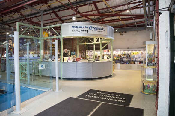
Museum for Children
I’m very pleased to have this building is my final selection because of it’s diversity compared to my other choices. The Museum on question is called ‘Enginuity’ and is situation in Coalbrookdale forming part of the Ironbridge Gorge Museums. This particular building was built **** and designed to house a fitting out shop for the adjoining foundry.
I was able to obtain a photo from the museum archives which is in my learning log (link at top of page).
Today the building is used as a museum to teach children about Engineering in exciting and interesting ways. Upon entry to the building is a reception desk and shop which is a logical first port of call for any visitors.
Photo 1
I thought it was important to demonstrate that the space still has an industrial feel by showing the steel structure of the roof. This is important because it links the old style of the building to the new.
Photo 2

This viewpoint allowed me to include as much of the space as possible and show the different activities and where they sit in the space. You can see the space is designed for visitors to flow from one activity to the other whilst making allowances for busy crowds.
Photo 3

This space has been defined as a rest area and whilst it sits within the same building some screening has been implemented to add to the comfort for visitors. Its a well thought out space and its notable that whilst screens have offered some respite its still very much part of the museum itself. Its a nice subtle addition to the use of the space.
Photo 4
Of course at the end of any children experience theres merchandise on offer. I like the way this space has been encompassed and is less invasive to the rest of the museum. I decided to use a portrait frame to isolate the shop from its surroundings, demonstrating how its within but separate the rest of the space.
When the museums space was being designed they consulted with residents, schools and child services personnel to obtain ideas and opinions on how the space should be utilised and what goes into it. This collaboration approach has resulted in a well planned and thought out layout incorporating all the ideas into one space. I find this a very exciting concept by ‘recycling’ old buildings and creating new spaces.
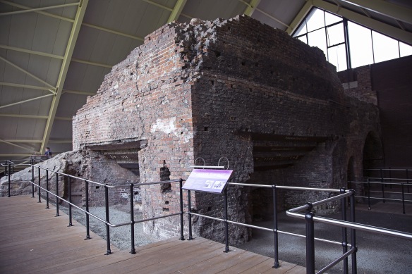
Historical Furnace
This furnace building wasn’t on my original list but when I saw it I thought it would be an interesting addition. This is the only building in my selection that has been built around it’s inside space. I find this to be an interesting concept and wondered how it would translate on photographs.
The building itself houses the remains of the water powered blast furnace where Abraham Darby I perfected the smelting of iron with coke instead of charcoal. A very important piece of history in the industrial revolution.
Obviously the furnace has been the subject of decay and to preserve it, a structure was built around it. The structure itself is a spectacle to be desired with it’s pyramid shape.
Photo 1
From this viewpoint the most complete part of the furnace is included. I tried to show part of its encasing too. The space around the furnace is quite limited although all that is needed is a walkway and this has been achieved. I felt it important to include an information point giving some clues as to the identity of the purpose of this space.
Photo 2

This perspective was created to give an identity to the use of the space including more signage and a visitor.
Photo 3
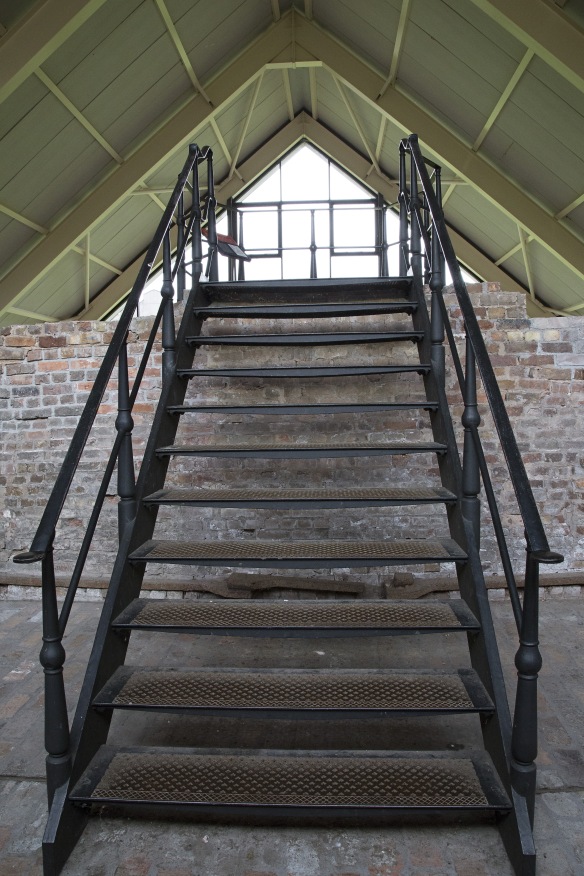
One thing this building was screaming out in it’s design is symmetry. In Photograph 3 I have tried to illustrate the use of symmetry whilst also demonstrating the use of levels to extend the visitor experience. These staircases increase the usable space available. I also find this is a pleasing image.
Photo 4

I don’t think a photographic description of this space would be complete without a view of the furnace chimney. It was difficult making this viewpoint an attractive photograph so I included some back and foreground to make it more interesting. I tried to capture just the top of the furnace but it translates as a photograph of bricks and had no meaning.
This building is a good use of space and designed in a way that no attended guidance is needed. It flows well and gives its visitors an easily accessible walk through experience. Ultimately the space was created to protect its occupant but has the added benefit of allowing people to visit this important monument.
In Conclusion
What did I learn from carrying out this assignment? It would be difficult to pin my learning experience down to one particular lesson as so many thought processes and tasks come out of shooting this assignment. The most important lesson in my opinion is to plan well for the shoot ahead. For example, researching the building cultivates ideas for how you want to portray the building. If a macabre building with a dark history was part of my selection then the style of photography would be much different to that of a children museum. It may even come down to the time of day or night you need to shoot depending on the lighting needed. I may have even photographed a spooky building at twilight but when I was arranging the church visit I wanted to make sure the sun was high in the sky so that light would come flooding from all sides of the church. If it was early morning then I could have ended up with too much light coming in one one side and darkness on the other as the sun would have been quite low. Another Important example is trying different viewpoints and putting yourself in shoes of the user.
I developed a method during the planning of this assignment and that was research, aim, plan, execute.
Research – researching the buildings I want to visit. What are they\were they used for. Do they have any significant history. This builds up a preconceived idea of how the shoot should take place and what kind of feel I’m going for. Is access available? should permission be obtained? Will I be able to shoot in that building? What equipment will I need?
Aim – thinking about what I want to shoot? how will I build up a story? Using the research to design a storyboard. Use different viewpoints to describe the space.
Plan – Putting the research and aims together and producing plan of action. Making contact with building managers? Creating a schedule of dates and times of shooting. Developing a list of actions to refer to on the shoot. Highlight things to try if others don’t work etc.
Execute – Carry out the shoot. Choose the best viewpoints to explain its use. Select images to be used. Write up.
When a photographer arrives for a shoot the perception is that they have simply picked up their camera bag and set off. Obviously I’ve demonstrated here that a lot of thought goes into research and planning before any shooting can take place.
What I have learnt above all else is that planning a shoot is equally as important as shooting itself. It’s not all about having the right equipment or choosing beautiful buildings or spaces. A lot of work goes into planning and its an important part of the process.
Overall Comments
Samantha, well done for your first assignment! You have taken an interesting series of images of your subject, demonstrating your creativity and imagination. At times the technical quality of the image could be improved, in particular the focus point of the image, but your compositional skills are very good. This assignment asked you photograph single subject over a series of 5 to 7 shoots. Although you have chosen a variety of locations and varied your distance from the subject they are predominantly ‘action’ shots rather than posed static images. Perhaps you should try to include some full-length portraits and torso shots in a more controlled, static environment in the future?
Assessment potential (after Assignment 1)
You may want to get credit for your hard work and achievements with the OCA by formally submitting your work for assessment at the end of the module. More and more people are taking the idea of lifelong learning seriously by submitting their work for assessment but it is entirely up to you. We are just as keen to support you whether you study for pleasure or to gain qualifications. Please consider whether you want to put your work forward for assessment and let me know your decision when you submit Assignment 2. I can then give you feedback on how well your work meets the assessment requirements.”
Feedback on assignment
The portraits you have produced for this assignment are varied and demonstrate that you haveare developing your visual language. The camera angles and point of view, in particular are varied and purposefully chosen. In a few of the images I think there is too much post-production. For example, in the autumnal image the face of the subject is incredibly smooth and without shadow, to the point that the features are almost invisible. You might have decided to reduce the textures etc. of the face to make the eyes really stand out – and they do – but the face is surrounded by the crisp and detailed textures of the leaves making it seem strangely lacking in detail. Also the coat and trousers are covered in pattern and texture due to the mud so there is busyness to the whole image making the face seem more incongruous. Perhaps a bit of mud on the face would have emphasized the character of the boy more – giving the image a narrative relating to the pleasure of play outdoors in the autumn? In reference to your own comments about the image – I agree that the complimentary colours work extremely well, and I think the gesture, framing and eye contact have been selected and captured very well.
The puddle image is very good, it really shows your confidence in experimenting with different ways of taking portraits – I agree that it doesn’t matter if the subject’s face is partially obscured in this image – the camera is the point of focus because it explains his activity / interest in the puddle. Showing creativity and taking risks is an important element of the module and you have demonstrated that you are developing your own voice and understand how ideas are communicated photographically. Well done!
Nevertheless, I think the bookshop image is less successful. The idea is good and the location is interesting but the image seems a blurred and it feels more like a snapshot or documentary photograph than a portrait. Perhaps if you had asked the boy to look at some of the books on the shelf you could have slowed him down a bit and given yourself the opportunity to take a number of shots to capture his gestures and expressions. If the subject’s face is not visible in the image, it is important that their pose or gesture give the viewer an idea of their emotional state or interest in the activity they engaged in.
In the fourth and fifth images the focus seems a bit off – the superman isn’t sharp and the beech scene focuses on the feet rather than the face – is this intentional?
Your final image is really well composed but the point of focus still doesn’t seem purposefully chosen. I agree that you don’t always need the subject to look directly back at you, but this doesn’t mean that the eyes are not an important part of portraiture. It you had positioned yourself slightly further to the left you would have been able to see his eyes and focus on them – this would reinforce for the viewer that the subject is looking intently at the screen. His absorption is the message of the image and I think the eyes would have communicated it very effectively.
In the assignment brief you are asked to mark your work against the assessment criteria in the handout – I would recommend that you complete this task and put your thoughts on the blog. It is important for you to identify your strengths and weaknesses using the assessment criteria, so you can think about them as you work on assignment 2.
Learning Logs or Blogs/Critical essays
Your blog is well organized and your annotation is thorough. It is good to see that you are reflecting on what you have learned in each exercise and considering how you will use the skills in your own work. Your engagement with the exercises will demonstrate the development of your technical and analytical skills to the assessor (should you submit for assessment). In the poses exercise your research is thorough and you clearly put the knowledge you have gained into practice when taking photographs. My only comment about your work for the exercise is to remind you that poses are not universal, so they may seem very natural for adults but awkward when attempted by children. It is important to think about the differences as well as similarities between subjects.
When you submit an assignment via your blog, I would recommend that you separate the images by other photographers from your own series. Perhaps introduce the assignment, present your series of images with annotation / comments on each image and then have a reflection at the end that brings in other people work and compares them with your own. This will make it easier for the assessor to distinguish between your assignment and research should you decide to submit for assessment.
I would like to see some more critical thinking research on your blog. In Key Concepts of Photography by David Bate there is a great chapter on portraiture. He also writes introductory chapters on the history of photography / photographs as records of history, and reading photographs using critical theory. I think all these sections would give you ideas for critically analyzing your work and the work of other photographers.
Suggested reading/viewing
As previously mentioned, I would recommend that you read some overviews of the theories used to decipher different genres of photography such as, Key Concepts of Photography by David Bate. Photography by Stephen Bull is also very good as it outlines some of the key texts by other writers and theorists on the subject of photography.
Also, the Taylor Wessing Photographic Portrait Prize exhibition is on show – have a look at the website as they contain a wide variety of subjects, types of staging and levels of formality. There are a variety of portraits of children in this years selection.
http://www.npg.org.uk/photoprize1/site14/
Try to analyse the decision making process of the photographer – why did they chose to frame the subject the way they did? Are there props or locations to suggest activity? Are they successful? This will give you ideas for future assignment work.
Pointers for the next assignment
Your eye for composition and timing is very good but the technical quality of the work is inconsistent – try photographing under different lighting conditions to develop these skills.
Take photographs and change the point of focus to different objects / parts of the image. Think about how this changed the meaning of the image and experience of the viewer then write it up on your blog.
Try to extend the variety of portraits you produce to mix formal / posed with spontaneous / active. They will produce very different outcomes and come with their own sets of challenges.
Overall Comments
Well done Samantha, the planning and thought that has gone into this assignment has resulted in a good set of images. Some of the images blend location, activity and the personality of the individual to create a striking portrait but in others the individual is lost or overpowered by the activity and the objects they are surrounded by. Because of this the series feel more ‘documentary’ than ‘portrait’, and could be improved by engaging with the subjects a bit more. Your annotation is very good, mixing practical information with your aims and intentions, demonstrating that you are thinking about how the images communicate to the audience. I particularly like your reading of the Seamstress image – the blurred hand is an important component of the image as it emphasizes the ‘manual’ nature of the tools she is using. Very good! You could further develop and strengthen your visual language skills by researching methods for interpreting images (such as semiotics) as it will help you to understand how objects are given meaning and how interpretation can vary depending on who the viewer is.
Assessment potential (after Assignment 1)
I understand your aim is to go for the Photography/Creative Arts* Degree and that you plan to submit your work for assessment at the end of this course. From the work you have shown in this assignment, and providing you commit yourself to the course, I suggest that you are likely to be successful in the assessment.
Feedback on assignment
You have chosen an interesting subject matter for this assignment, and although you are quite critical of the signs of contemporary life such as the ‘no smoking’ sign in the chip shop portrait, I think the things that provide clues about the ‘real time’ of the image make them interesting. It makes it clear that the photographs are contemporary, so I am able to interpret the people in the photographs as actors and actresses, and I add layers of meaning about reenactment and museums / historical tourism.
In some instances (The Steam Engineer, The Swing Operator and the Horse Wash) I felt the images were leaning too far towards documentary. Although this assignment is about people and activity, it is very difficult to view the individuals and glean information from their gestures, poses and expressions. Some of the photographs work very well, I particularly like the cobbler as he is nicely framed by the tools of his trade and the muted colour pallet of the browns and blacks of the leather compliment the muted tones of the figure (black, white and skin tone).
This series could be stronger if it emphasized the individual personalities more. None of your subjects engage with the camera, they are all totally engrossed in the activity taking place. Although the assignment is about activity, it would have been nice if a few of the subjects were looking into the lens. This would make the series of photographs more about the people who work at the museum – rather than ‘what activities the Victorian’s undertook’ – which I think is the real subject of the photographs. If the viewer wanted to find out about Victorian life they could look at photographs from that time. the interest of the public in that time period and our desire to experience it through reenactment museums is far more interesting! (I think those Victorian photo studios you find at seaside resorts are really interesting too – this could be a subject matter for future projects?)
Perhaps you could have positioned yourself as a customer in some of the shots?
Having looked at the exercises you have undertaken, I think there are a few good examples of what I mean in the ‘An Organised Event’ section of your blog – particularly the child on the woman’s back (the location tells me a lot about the event but I engage with the child as an individual subject making it a portrait of that child) and final one of the concentrating girl (although she doesn’t look directly at the camera she is isolated from the rest of the activity so I know that she is the main focus of the image).
I wonder if you could revisit the subject matter of the Victorian museum with a ‘looser’ approach to taking the images? I think you were so intent on capturing ‘activity’ that the compositions of your images became a little repetitive and the individual in the photograph was sometimes overwhelmed by the activity and the objects around them. (Although I know you were also limited by the size of the location and barriers etc. in a number of the shots).
Although you say in your annotation that you are interested in all things Victorian, I think the real interest in this subject lies in the ‘reenactment’. It would be really interesting to document the people in contemporary clothes, or in the process of transforming themselves into Victorians. This way you could blend activity and more classic ‘portrait’ shots while still giving the viewer information about the subject matter. Alternatively you could think about the activity of visiting a Victorian museum – what is the appeal for the audience?
Learning Logs or Blogs/Critical essays
Your blog is up to date and your annotation continues to be reflective and informative. The only technical issue I found was in the ‘organised event’ section when I click on the images to enlarge them the wrong image loads!
I would like to see more research on your blog – particularly the photographers you are looking at (and whether you like their work / why?) and the photography theory / portraiture theory research you are doing.
Also you should refer to the assessment criteria in your annotation – what are your strengths and weaknesses? Which areas do you intend to improve upon and how? This will be really beneficial for future assignments.
Suggested reading/viewing
As previously mentioned, I would recommend that you read some overviews of the theories used to decipher different genres of photography such as, Key Concepts of Photography by David Bate. Photography by Stephen Bull is also very good as it outlines some of the key texts by other writers and theorists on the subject of photography. You are very good at looking at all the separate objects / actions in your images and thinking about how they build up to create meaning for the viewer – reading up on semiotics, and ‘how to interpret photographs’ will really strengthen your understanding of how images communicate and this will further inform how you take your images.
Have a look at the photographs of Martin Parr and Daniel Meadows, in particular a series called ‘June Street’. In these portraits Meadows and Parr documented all the inhabitants of the street in their homes. There is a great blend of portrait and objects (which act as further signifiers of personality) – they might give you some ideas for this work http://www.magnumphotos.com/Catalogue/Martin-Parr/1972/GB-ENGLAND-June-Street-1972-NN162445.html
You could also look at Anna Fox, as her work blends documentary and portraiture in order to inform the viewer of the people and the activities they are involved in, although I think they are less successful aesthetically and sometimes appear to present the individual in quite a mocking way. (Workspaces)
Pointers for the next assignment
The assignment suggests that you submit prints – I would recommend that you send assignment 3 as hardcopy. It is good experience to view images as prints because you will see things that are not obvious on screen. It is also very important to gain experience of colour management specifically for print.
Your planning for this assignment is good– you are clearly thinking about what should be included in each shot and how you will achieve it. For future assignments I would recommend that you write a ‘shot list’ for each location or individual so you have a record of all of the activities you want to capture and also distances / camera angles etc. This way you can ‘tick off’ the shots you know you definitely want to capture, allowing you to play around and experiment once the must-haves are done.
Spend time looking at the work of other photographers with the help of my suggestions and also the photographers featured in the module handbook. This will give you ideas for compositions and will help you to develop an understanding of your own likes / dislikes which will help you to build your own visual style.
Overall Comments
Samantha, you have photographed a wide variety of buildings and created some good quality images, but it is important that each image in a series gives the viewer new information to help them to build a picture of the space. When you rework this assignment prior to formal assessment avoid including similar photographs or photographs that show the same view / objects. The images in the church are very well composed and you have clearly thought about how the available light will affect the atmosphere of the images. The next challenge is to try to recreate the style of the church images in artificially lit spaces that contain irregular features!
Feedback on assignment
Demonstration of technical and Visual Skills, Quality of Outcome, Demonstration of Creativity
You have chosen a variety of buildings to document, each with a very different style of space and use. Although I am sure you learned a lot from dealing with the challenges each building presented, a more coherent series and a more in depth study of the buildings might have resulted if they shared some characteristics. For example, if you had decided to document entertainment and leisure spaces, such as the cinema and childhood museum, along with other social activities spaces you could have used what you learned from each shoot to help you develop a visual language for the next one. The cinema seems to be characterised by quite open spaces, but you have composed your images in a way that reduces the impact of space, at least one wide angle shot would have established the scale of the space allowing you to focus in on particular details such as interior design features, particular corridors etc. I realize from your planning and preparation notes that you were told not to photograph in the cinema, which is probably why the composition of these images seem a little rushed. For example, Photo1 contains a large area of empty floor but the interesting lighting feature hanging from the ceiling is cropped out of frame on the right hand side and the top of the wall is also cropped in image two. To achieve very balanced images it is important to carefully frame each shot so you include exactly what you want to and make sure vertical lines are straight etc. Photo 4 gives me a much clearer idea of the space and use of the cinema. The little boy looking at the sign gives context and the combination of sweet packages and film adverts create a very bright and engaging display.
Your images of the church are more successful as the composition is very tightly controlled – well done! But, three of the images are quite similar – photo 3 is a close up of the altar in photo 1, and photo 4 is the view from the opposite direction. I think you could explore the space more in this series, showing different architectural or furnishing details – or perhaps looking from an unusual viewpoint – what would photo 4 look like if the camera was placed close to the ground? What would the chandelier lights look like if shot from directly below? Try to be more experimental when you shoot. It is good practice to make a list of the shots you know you want (or sketch out a shooting script if you prefer), that way you can tick off the ‘must have’ shots and then you will be able to experiment freely without worrying that you haven’t got what you need. Surprises and unexpectedly creative results will occur!
The deli images also contain some interesting shots – the one from the customer’s perspective is very effective but on the whole the images do repeat the same information about the space. Again close up shots and unusual perspectives might help you to create a more informative view of the space. You could also shoot from the doorway or through the window to add more variety to your series. Another example of a more experimental approach could have been to shoot the museum of childhood from the perspective of a child, as I imagine the displays and interactive sections are designed for small people!
On the whole you have taken some good individual images but you need to think more carefully about how you edit the images into a coherent series. Because you have to describe each space in only four images it is really important that each images adds information for the viewer, helping to build their understanding of the location. A greater variety could be achieved if you allow for a little more experimentation in each shoot.
Coursework
Demonstration of technical and Visual Skills, Demonstration of Creativity
Your coursework shows that you are engaging well with the exercises in each section of the module. Your images relating to symmetry and point of view are good quality – make sure you remember to apply these skills when shooting for your assignments! Your images in the church most effectively applied your knowledge of use of natural light, symmetry and composition, but the next challenge is to apply these ideas to spaces like the cinema or museum of childhood, where the light is artificial and the spaces set out in a less symmetrical way. Think about how will you create atmospheric, balanced compositions in these spaces?
Research
Context, reflective thinking, critical thinking, analysis
You are beginning to carry out research into exhibitions and professional photographers, but I would like to see more! The more you look at other people’s work the quicker you will learn your aesthetic likes and dislikes, which will in turn help you to develop your own visual style. The lensculture blog contains lots of cutting edge contemporary photographers from a variety of disciplines and genres. Archives such as the V&A museum (and the Art Library which they house) and the Tate gallery websites are great resources. You could also look at the Taylor Wessing Portrait prize website – they have an archive of past winners – the range and originality of the work is breathtaking.
In terms of photography theory, I recommend Key Concepts of Photography by David Bate. Photography by Stephen Bull is also very good as it outlines some of the key texts by other writers and theorists on the subject of photography.
Learning Log
Context, reflective thinking, critical thinking, analysis
Your learning log is well organized although I would like to see more research and critical thinking. It is important to analyse why successful images are successful and why you don’t like those you deemed to be less successful. This will help you to understand how to successfully compose images, how images communicate to an audience and what your preferred visual style is.
When you are discussing your own work it is good practice to read through the assessment criteria and try to assess your images – think about your strengths and areas for improvement – this will also help you to develop.
Suggested reading/viewing
Context
I have recommended some books and websites for viewing contemporary photography in the research section. If you have any preferences of style or genre please let me know and I will send you some more tailored suggestions.
Pointers for the next assignment / assessment
Overall Comments
Samantha, you have produced an interesting series of images for this assignment. You had a very clear aim for these images – to show the town as residents rather than tourists enjoy it – and some of the images really show the location (using distinguishing landmarks very successfully) and activity. However I don’t think the images you have selected for the final series really get across that the people are residents as the activities they are undertaking could be interpreted as tourist activities. Please see below for more in depth feedback.
Feedback on assignment
Demonstration of technical and Visual Skills, Quality of Outcome, Demonstration of Creativity
Your images give a strong sense of place because you have used key landmarks very successfully. For example, the images of the painters and the family fishing (I think!) have the bridge in the background so I know what town you are referring to. They also include a good amount of scenery so I get a sense of geographical location too. I like that the bridge is doubled in the photograph of the painter – I see most of the bridge in real life and most in his painting of it, giving the photograph two areas to focus my attention on, encouraging me to look at the image for longer. The fishing one is well composed in the arrangement elements – the relation between the people and the bridge – however, the area of shadow in the foreground doesn’t really tell me anything, so it is non-space in the image that does not attract my attention. In future I would recommend angling the lens toward the sky a little more, to crop out quite a lot of the shadow and avoid cropping the tops of the trees off. You should also take care with post-production editing as this image has a halo effect around the trees where you have burnt in the sky to give it more detail / depth of colour. Sometimes these effects are not obvious on an illuminated screen – which is why it is good practice to do test prints when you are finalizing images.
I think the image of the man and boy walking next the river with the power station stacks in the distance also shows good use of landmarks to give a sense of place. I would be tempted to try to dodge the highlights on the people to make them a bit more prominent, and burn in some of the details in the background behind them (particularly the cars) so there are no distractions in the ‘dark area’ of the image. The image of the subjects in the tunnel is a nice observational image, however I probably wouldn’t include two images of the same subjects if the series were not intended to be about those people in particular. Because the other images in the series contain a variety of other people I am given more of a sense that the series is about the place rather than the people. Also this image could be stronger compositionally if you had not cropped part of the area of light cast inside the tunnel – could you have taken the image from further back? Also the content of the view shown through the end of the tunnel could have been more purposefully considered. If you have taken a few paces to the right the view might have been more ‘green’ and might have enabled you to conceal the van behind the subjects – giving a more idyllic view of the place. The composition of the image of the couple could also be improved. Although you include a number of shots of the bridge, it is a strong focal point in this photograph so you should step back and include a bit more of the structure. It is not clear what the couple is doing and the bollard in front causes a visual distraction, reinforcing the bridge as a central focus. In future try to compose the image to emphasise the couple and capture a gesture or expression that gives the viewer a clue to their activity.
As I said in my initial comments, you have taken some very good images but they don’t really tell me that the subjects are residents. When you rework this assignment have a look through your contact prints and try to think about how you can get this idea across more assertively. Perhaps if the little boy was in a school uniform, or other subjects were in recognizable work uniforms it would be more obvious that they live in the place?
I have reviewed the 6 images you did not select and I don’t think they would reinforce the idea of resident. Also I don’t think they are as well composed as they ones you have selected. When you review your work think about what the focal point of the image is – where is the audience going to look first and why? Is that what you want them to concentrate on? If there is no obvious focal point think about how the composition could have been arranged differently to give the image more attention grabbing focus.
Coursework
Demonstration of technical and Visual Skills, Demonstration of Creativity
Although you haven’t written all of your coursework up yet, you have produced some interesting work. I think you still need to be careful with your composition as the main focus of the image is sometimes obscured. For example, in the small figure in the landscape the figure is half concealed by bushes. Although his red t-shirt still draws your attention to the figure it is difficult to engage with what he is doing and why he might be standing there because he is partially obscured. The ‘busy traffic’ composition works much more effectively – the activity of the people draws me in and leads my eye up to the power station. The contrast between families in the sun and the industrial structures give the image real interest and tension. This image would be very effective in your final 6 for the assignment as it evokes ideas of resident because it is a sports day and the towers give a sense of location. (Although I agree it would be even stronger if the children were running in a race at the time!)
Research
Context, reflective thinking, critical thinking, analysis
I don’t think you have uploaded any research for this section of your course. As I mentioned in my previous feedback, try to see some exhibitions and also read reviews online or in photography journals to give you more of an idea of how to write / think about your own work and the work of other practitioners.
Learning Log
Context, reflective thinking, critical thinking, analysis
Please see my feedback from the previous assignment. Further to it – research in this sense tends to relate to other photographers and theorists rather than planning research you have done for an assignment. If you are doing research for an assignment (i.e. looking at locations or finding out about the subject of your images) include it in your blog posts relating to planning for the assignment rather than in the research section.
Suggested reading/viewing
Context
Please see my feedback from the previous assignment.
Pointers for the next assignment / assessment
