Exercise 7: Varying the pose

When I read through the brief for this exercise, I immediately thought about one of the most photogenic men that ever walked this earth, James Dean.  However that man posed he looked perfectly at ease.  I don’t know if he was directed by a great photographer each time or he just had ‘it’.

images-15   968full-james-dean images-13          images-14James Dean             james-dean-everett

If you look at this selection of photographs of James Dean you will notice that his hands are always posed in a natural and comfortable way.  In the top left photo he is leaning with his arms on a car but one arm is stretched out.  In the photograph bottom right James is lying down with one arm propping him up but notice his other arm is resting on his body and he looks perfectly at ease.  He also poses his legs in differing was for example, In the top right photo in addition to his hands holding a rail he has replicated the symmetry with one of his legs.  If his leg wasn’t raised this would be a very different, less pleasing photograph.  All of these photos have other qualities too with great lighting and the use of props but fundamentally this was a man who knew how to pose.

Actually, the brief was to look through magazines for different types of poses, not just the basic standing, sitting, leaning etc but how the limbs are positioned.  I looked at online zines so I could post my findings on this blog.  All the time thinking about James Dean and how many great portraits exist of him.

In an attempt to fulfil some of the brief I found this posing board online:

Poses-for-women-Portrait-photography-ideas

It gives different ideas for posing women and in particular what to do with their hands.   Here are some photographs of these poses in practice:

374ddf361776c2490e363931e95422a0 bride-poses-for-portraits-at-Mandalay-Canals-Las-Colinas posing5                web_taylor_comstock166 woman-sitting-on-chairboudoir-photography-poses-full-body-3

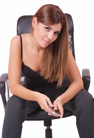
These photographs demonstrate some differences in poses although there is one of these poses which I think doesn’t work very well. Take a look and decide for yourself before I continue.  Yes, it’s top right!  I think the model in this photo looks hunched over and rather butch.  To improve this I would have had the forearm resting on the wall as well as the hand and more of a gentle glance over the shoulder.  You may disagree but this is my opinion.

The next part of this blog is putting what I’ve learnt into practice.

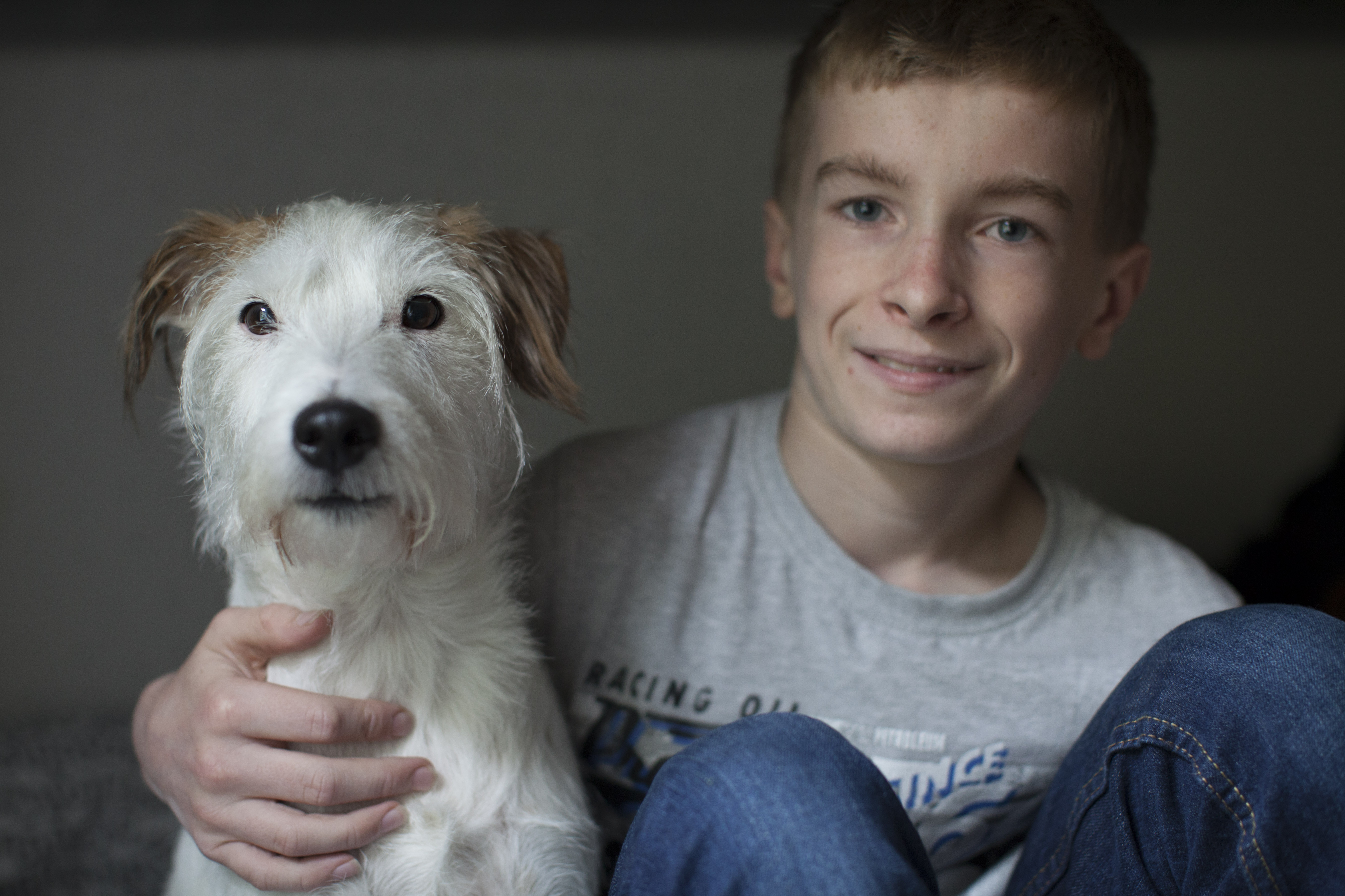
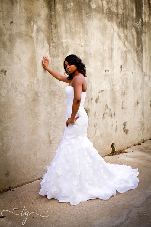
The main reason for me wanting to do this module is that I photograph children for a living. My aim is to improve upon this and also venture out into other genres of portrait photography. So, it seemed natural to photograph a child for this exercise although I realise directing a child is far more difficult than an adult.

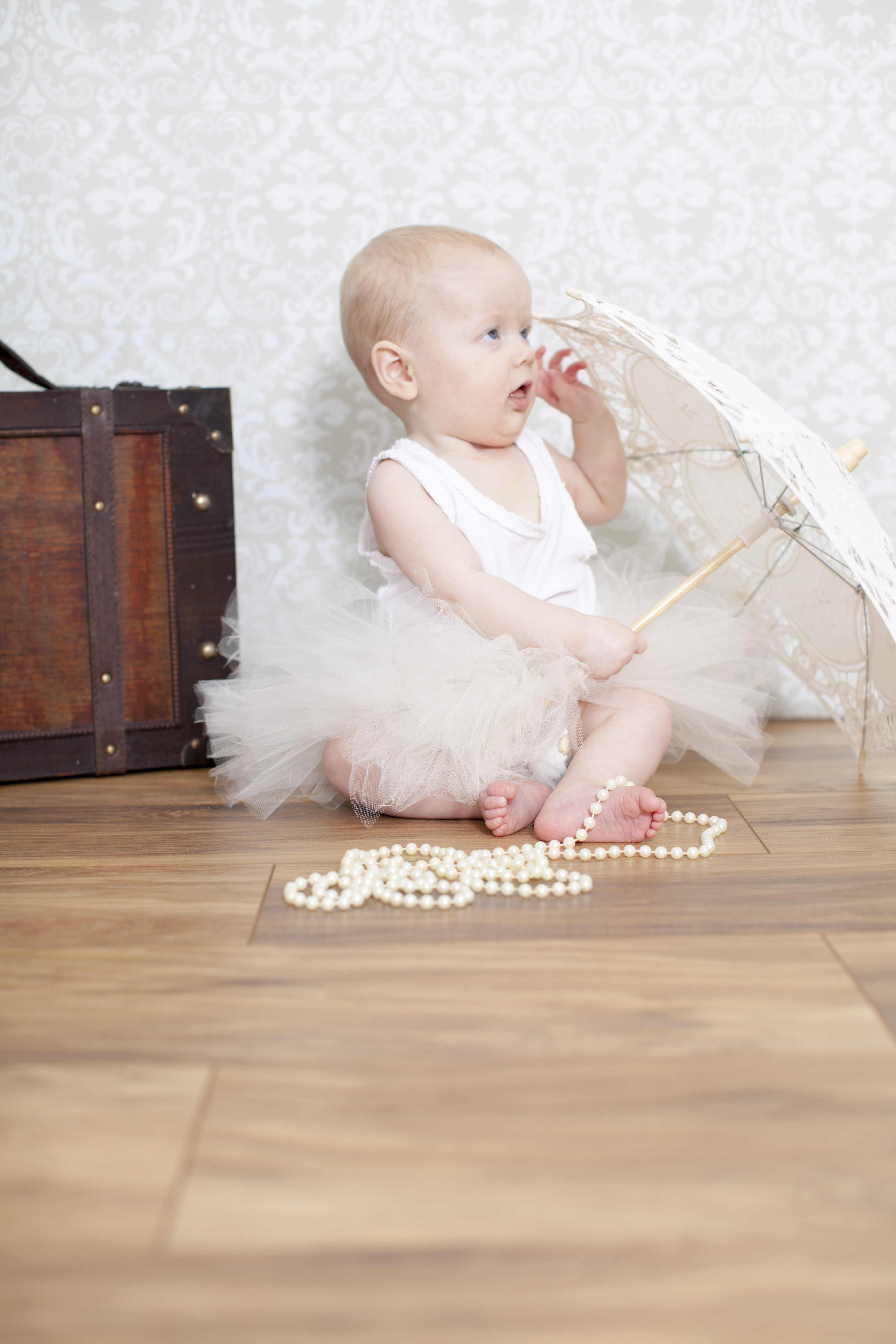
I wanted to create a series of shots that showed the direction I was giving in terms of limb position whilst standing, sitting and lying down.  The way I achieved this was to demonstrate to the child what I wanted her to do i.e. The photograph of her lying on her tummy, proper up with her arms and hands crossed; I got on the floor myself and showed her the pose.  She thought it was a game and was happy to copy me hence the fact she’s laughing in most of the photos.  Where children are concerned I want them to feel at ease and have fun.  I find this gets the best results.

Ella Hughes_0101 Ella Hughes_0117 Ella Hughes_0114 Ella Hughes_0038 Ella Hughes_0035 Ella Hughes_0033 Ella Hughes_0028

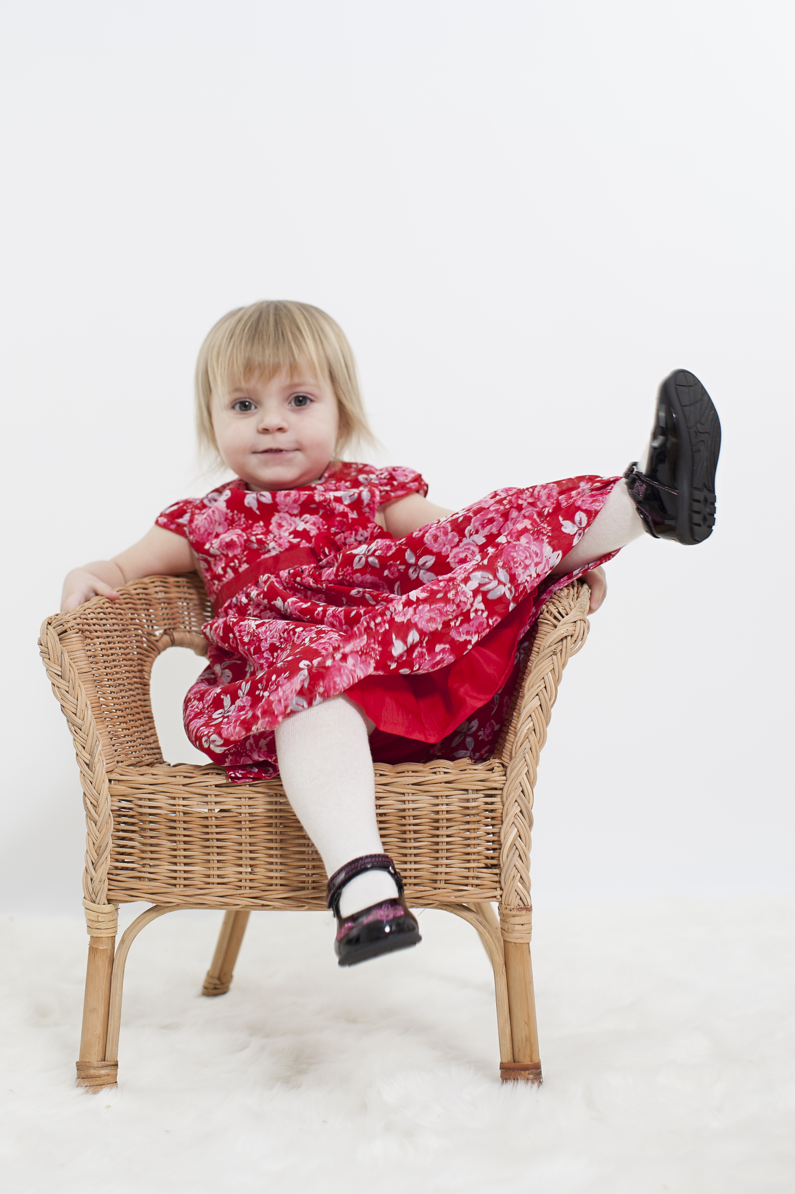
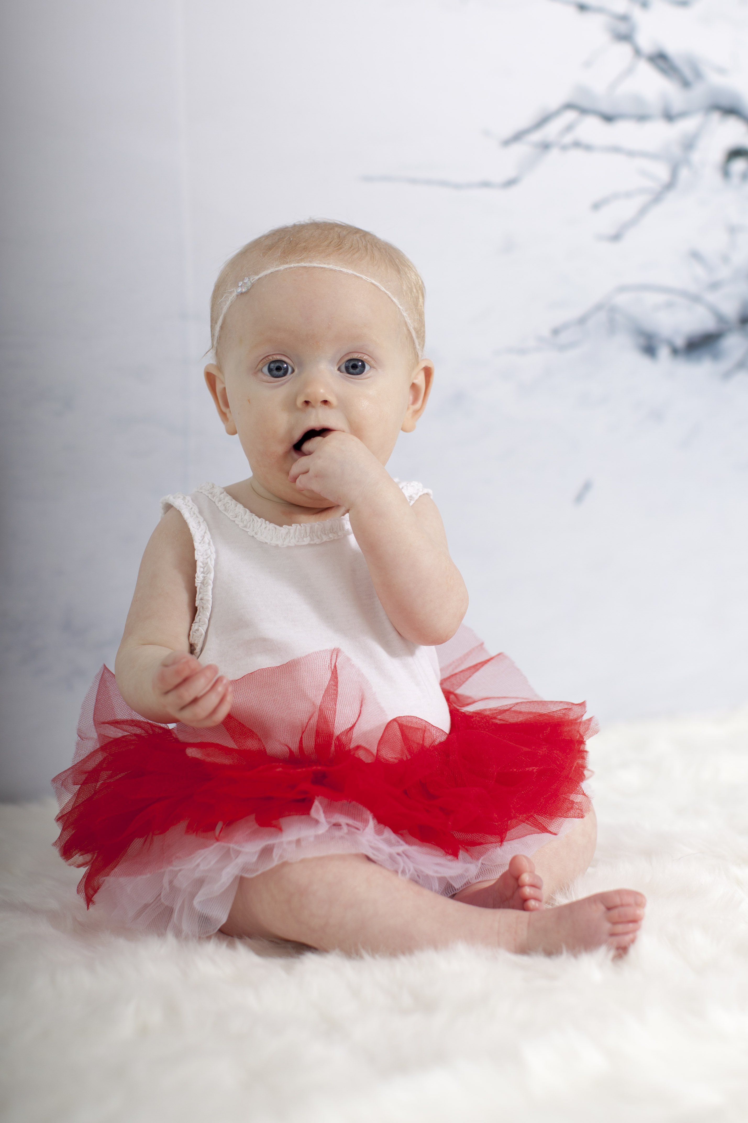
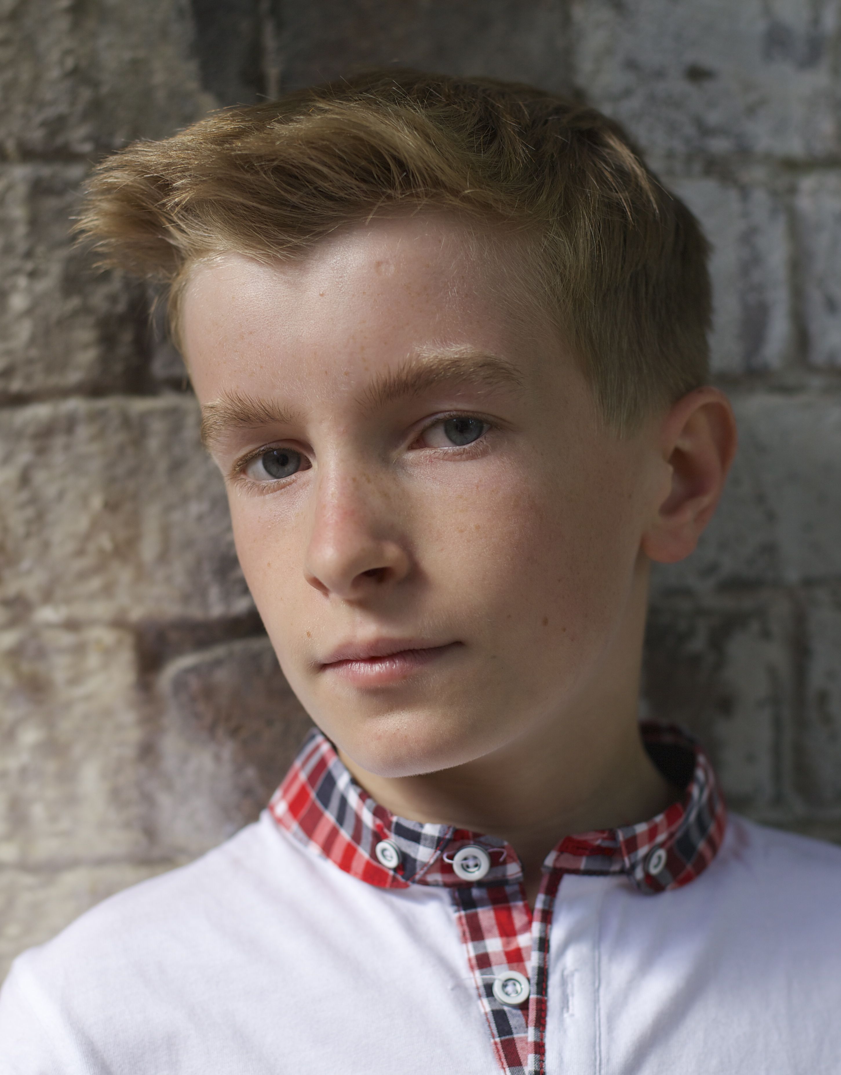
I’m happy with what I’ve achieved here.  The main point for me was for these photos to appear natural and relaxed.  There was one pose I wanted the child to do which was both feet up on the side of the chair, if you look at the photo above I don’t think it was successful.  The reasons are that the child’s legs weren’t actually long enough for this pose and when she tried it looked awkward.  Then we tried one leg up which is the next photo along and it worked much better.  The child had a natural tendency to look at the camera but I wanted to vary the direction of her eyes and encouraged ‘mum’ to call her on my signal. The photo of this kind that works best if the one where she is on her tummy looking back at mum.  It’s very natural, fun and cute.  The other photo with her looking out of the frame isn’t so successful.  It’s ok, it’s just not great.  It’s slightly forced and she doesn’t look at ease.

I’ve been looking through my books to cress reference some of the work I’ve done here but I can’t find a photographer that jumps out at me.  I will revisit this again in my next session.

Exercise 6: Focal Length

When photographing portraits, focal length will play in important role in the attractiveness of your subjects.  This is what I was telling people when I was seeking a  model for this exercise.  The first thing that came to mind for them is ‘she’s going to make me look unattractive first!’ I got a lot of firm no’s.  Especially as these images would be made public for anyone to see.  So, eventually with much resistance one morning I said to my husband ‘just let me take five photos quickly and we’ll say no more about it’.  He was tired, agreed and here we are.

The purpose of this exercise is to demonstrate the different results you will get with the same subject and the same framing.

24 mm

24mm copy

So, this is my husband.  At a 24mm focal length his face looks like a caricature of himself.  The nose and glasses are pronounced.   This is the image that prevented me from getting a model to agree to this shoot!

50mm

50mm

At 50mm the face is looking more normal. The proportions are right although there still seems to be some distortion of the face.  I use a 50mm for portraiture in the studio when photographing babies and children.  The being anything longer and I can’t get them in view as there’s no room to move far enough back.  I also use in on photo walks to get close enough for detail and the amount of light that enters is great too.

60mm

60mm copy

Gosh,  a smile.  Even my husband is in more of a focal length comfort zone.

100mm

100mm

At 100mm the features appear less pronounced and more attractive. I will use a 100mm lens for portraiture if I have the room.

I should say here, I just sold my 85mm lens that is meant to be the ideal focal length for portraiture but I just couldn’t get on with it.  Focusing was extremely difficult mainly because of the weight of the lens.

105mm

105mm

Here at 105mm this looks true to life.  Actually I’d say my husband looks slightly more attractive here.  I know one thing for sure, he won’t pose for me again!

When we compare the two images at either end of the scale the differences are very dramatic:

105mm 24mm copy

This demonstrates that the longer the focal length the more flattering the features are of the face.  I would agree with this however, there are some limitations to using longer focal lengths for portraiture.  Getting up to 100mm and beyond you would have to stand further and further away from your subject and in some circumstances, i.e. a studio setting this isn’t posible.

Exercise 5: Eye contact with expression

The purpose of this exercise is to examine the difference between what I think will make a great photo during a shoot to what the photo actually looks like after the shoot.

I set up a portrait session in my studio with one of the babies I photograph regularly.  The reason I chose this particular baby is because she is familiar with me, my camera and the studio.  In addition to this she has a very good expression range and can look different in each photograph depending on her expression at the time.

I shot her in different scenarios to keep up the momentum and get more out of the session.

After the shoot i wrote down how I think the shoot went:

‘This was a fun photoshoot with a very obliging baby.  I was able to direct her to get what I considered the shots I set out to achieve.  If I wasn’t getting happy smily faces then I would hand the baby a prop related to the scene and the difference was immediately noticeable.  Her eyes lit up her face shone and there were plenty of smiles to capture.  I also shot some more candid moments although I did this for testing light more than anything and dismissed the photos as being purely for that purpose.  One thing I did notice is that you can only call her name so many times before she’s going to ignore you but by triggering shutter remotely I was able to gain her attention by squeaking a toy or saying something different in a high pitched voice.  Soft toys work just as well, especially the phenomenon that is Sophie the giraffe!

I’m expecting to have captured some good smily photos with the eyes looking down the camera lens.  During the shoot I checked through the photos and it appeared that I had plenty of smily photos, some comical ones and lots of ‘off’ shots i.e. eyes closed, hand in front of face, out of focus etc.

For me, the time to stop shooting was when I was both happy I had enough shots that I set out to achieve and when the baby became tired an unresponsive to my attempts at entertainment.’

The next stage of this exercise was to upload all my photos to my mac and sort them into sections of 1. not good, 2. acceptable, 3. good, 4. Best single shot.  I’ll include a few photos of each (except 4. Best single shot!).

1. Not Good

Beau2 Beau 1

The first photo isn’t good because the composition is wrong, it should be landscape, and the baby eyes in an awkward position.  I don’t mind the baby not facing the camera though.

In the second photograph the baby has her hand in her mouth which I don’t think i noticed at the time.  I wouldn’t have triggered the shutter if my mind was on the baby expression.  I think I was trying to get the correct exposure as this does seem underexposed to the left hand side.

2. Acceptable

_MG_0420 _MG_0368

I think both of these photos are acceptable although they’re not great.  The smile looks slightly awkward and forced although the rest of the elements of the photo are good.  In the first photo the eyes are pointing slightly away from the camera with is a pose I like.

3. Good

_MG_0310 _MG_0311

I think both of these photos are good.  Obviously the baby eyes are closed in the top photo but I think this is showing a playful expression and bringing out the babies personality.  The bottom photo is joyful with the cheeky smile and again I don’t mind the eyes not looking down the lens, the point is the eyes are bright and show expression.  As a sequence these two photos together are great and gives a complete set of expressions for one given scenario.

4. Best single shot

_MG_0356

This shot for me has everything that a great portrait should have.  Look at the babies expression, she can’t help herself from laughing, the eyes are laughing too.  She’s looking directly at the camera.  She’s even leaning in to get closer.  Her little hands are symmetrical and gripping the wooden box in exactly the right place to expose the lettering.  The compositions pleasing, the lighting is good and the baby looks great.


In conclusion there were some shots in the sequence that I thought were going to be better and others that I didn’t really think were great.  This one in the wooden box for example, I thought the baby would look lost in it and it would just look like a baby in a box which is strange in itself.  However, against the odds it worked.  When I reviewed the first set of photos of this scene it was clear that the baby needed to be more prominent so I propped her up with a stuffing filler and it transformed the whole composition. I was so pleased I reviewed my efforts before moving on to another scene otherwise this photo would never have happened.

Exercise 4: An Active Portrait

My aim here is to photograph a subject whilst carrying out a natural activity to show expression.

I knew immediately who my subject would be for this task.  I have a friend who works in the corporate world and therefore is photographed quite often either for cv portraits, corporate website profiles and project related news.  Ever photo I have ever seen of him looks awkward, even bordering on nervous, which I know he never is.

I chose for his setting to be a familiar to him, his office, to give him an element of feeling relaxed.  The activity is my subject during a planning meeting where he is explaining the footprint of a new development.  This is very much within his comfort zone although when I started shooting I noticed he seemed very conscious of his movements and they became quite staged.  Eventually I asked him a question about the development hoping that he would direct his answer at both me and his colleagues.  By doing this he saw me as part of the meeting and not someone pointing a camera at his face.  This is the outcome:

_MG_9966 _MG_9962

By giving my subject an activity to concentrate on it took his focus away from the shoot resulting in a much more natural photograph showing his genuine expression.

Exercise 3: Lighting Techniques

In this exercise I have considered different lighting and techniques to adequately light a subject and also manipulate the light for different desired effects.

The first type of light I used was simply window light.  I like window light because it can be directional, diffused and clean:

Jack1

I have used the window light to completely light one side of the face with the other side casting some shadow from the nose giving the impression of depth.  For a more detailed look I have added a silver reflector to light the right side of the face by bouncing the window light:

Jack 2

In this photo the face has is more evenly lit showing more detail.

I carried out this exercise when everyone was preparing for Halloween which gave me idea to use some dramatic studio lighting to light the face giving a darker feel as if to appear scary:

Jack 3

We are used to seeing faces lit from above by the sun casting shadows on the eyes and lips but to create this menacing look I pointed a studio light (no diffusion) upwards towards the face.  It created a more sinister look casting shadows on the nose, cheeks and forehead but leaving the eyes brightly lit making them a focal point.  I tried getting the subject to look menacing too but he had a natural smile and it looked much better.

Again, within the Halloween theme, I added a green diffuser to a studio light for this ghoulish inspired portrait:

Jack 4

The aim here was to only light one side of the face so the studio light was placed at face level to one side.  I wanted the green diffuser to be subtle and the right side of the face to be almost hidden in shadow.  I think it’s worked but in hindsight I should have used a black background and no fill light.  The effects would have been more dramatic.

Direct sunlight, in my opinion, is the best type of light to use.  The problem is getting it just right.  I know how odd this sounds as we have no control over the light shining down from the sun but we do have control over the time of day and location we use.  The sun is at its brightest when it directly above generally during mid day.  When the sun is high in the sky it will cast deep dark shadows on the eyes and that is your subject isn’t squinting.  When the sun is lower, earlier morning or later afternoon it casts long shadows on full body portraits in addition to anything thing in the background that stand upright such as buildings and trees.  The position that you stand or sit has a huge effect on the overall photograph.  I always used to ask my subjects to face the sun but his produces scrunched up faces and hidden eyes unless there are clouds in the sky to diffuse the light.  If the sun is bright I tend to ask my subjects to put their backs t the sun so avoid squinting and use a flash to add light.  This works quite well if you have a flash to hand.  I have got into the habit of carrying silver foil in my camera bag so I can reflect the light onto my subjects if it’s just a head and shoulders shot.  For this next photograph I asked my subject sit on some steps with a wall either side that wasn’t very tall.  This eliminated any harsh light although I chose to shoot the photo late afternoon when I knew the light wouldn’t be so harsh:

Jack 5

As you can see there is some darkness in the eyes although the overall light is quite good.  I added a gold diffuser to add some warmth to skin and light up the eyes to show more detail:

Jack 6

I think this is a far more pleasing photograph.  The light is a nice temperature and the face is nicely lit showing all the detail of the face.

I feel like I’m literally scratching the surface of lighting techniques here and within six photographs can only show a very small example of what can be achieved.  On a lighter note, I’m convinced that my dog can be used as a reflector:

Jack 7

His white fur seems to be reflecting light onto my subjects face here where it should be in shadow.  If you think outside the box there are lots of things you can use to reflect light without spending any money!


Exercise 2: Thinking about location

I must admit the brief of this exercise made me laugh because I’m always pointing out ‘great backgrounds’ to my husband but when it came to it I couldn’t remember where they were.  The brief also says its handy to carry a camera around with you to capture what you spot as you go about your everyday life……..easier said than done!

I went through a phase of photographing backgrounds, things like doorways, just doors and lone benches.  I didn’t know why at the time but I guess I was thinking they would make great locations for portraits which is what this exercise is all about.

I tried to think wider than doorways although I couldn’t resist this one:

community centre doors

This is the only remaining original door at the local community centre.  I like it as background location because it has some qualities that I look for in everything such as, symmetry, character (aged), texture, colour and great light.  I could see a married couple from a vintage wedding stood in front of this doorway as long as their attire could accommodate a background.

I’ve used a plain brick wall quite often when photographing people:

Brick Wall

For me the humble brick wall has everything a background needs; complimentary colours, repetition, no distracting features, lines, symmetry and it’s the same from end to end which every way you look at it.  The only issue I find is getting the light right.  Too much such and it drowns out the background, too much shade and it doesn’t show enough detail.  This works best in diffused light and can be made to look good with many different focal lengths.  I have an alternative to the brick wall that adds a focal point:

Darby Road Sign

I started to think about backgrounds that were more involved but still wouldn’t be too distracting from the subject.  With a lot of beauty in nature I decided to head for the park and pick out some backgrounds that would suit a family portrait:

dale end park benches dale end park

Although both of these backgrounds have quite a lot going on there are elements within the photos that lend themselves to creating focal points for portraits. In the top background the benches are crying out for people to be sat there.  In the photograph above the path leading through the arches would create a lovely setting for a full-bodied family portrait.  These locations are great for diffusing the harsh sun light with the use of trees and foliage creating some shade but with some fill light still coming through.

This next location was chosen for its abundance of colour, height of the flowers and a distinguished landmark in the background.  Again off centre so a person can pose on the left of the photo to create a balance:

sluice gates

Here, with a person included in the background you can see how the height of the flowers matches the person’s height making the subject blend in well and now the photograph seems more balanced:

Sluice gatesThe subject is wearing a contrasting colour to the flowers to make him stand out more.

In this final background I wanted to find a location with lines that would lead the eye to the subject:

Loamhole Dingle

Immediately you can see where the subject should be placed.  It was tricky to decide upon a posing position because when the subject stood up the balance was all wrong and also it looked forced and awkward.

I asked the subject to crouch down and this seemed to do two things:

1. I balanced out the heavy foliage on the left of the background

2. The harsh light was diffused by the foliage meaning the subject didn’t have to squint but left enough fill light to light the scene.

Loamhole dingle

I’m pleased with this location and also finding a pose that fit in with the low-level of this scene.  I will use this again for portraits.

I enjoyed looking for suitable locations for backgrounds and it quickly became second nature to me again.  I had got out of the habit as largely there are backgrounds everywhere although not all are suitable.  A cluttered background just distracts the eye from the subject making a not so pleasing photograph.

People and Place – Exercise One – Scaling and Setting – Part Two

As a photographer of natural or candid poses this exercise was more of a challenge than I initially thought.  I had to consider the composition and the weight of attention to place on the face of my subject.  Normally, I would patiently shadow a subject once placing them in a desired location and even considering the composition but posing is largely down to my subject.  I’ve always felt this captures the essence of my subjects personality better as in this portrait I shot in the Spring:


IMG_0913The subject was smelling the flower and it seemed like an opportune moment to take the shot when suddenly he looked up with this innocent look on his face.  His eyes are looking straight at the camera and when reviewing my photos this one stood out to me because the subject is holding my attention in his gaze.  This made me think more about What I wanted my audience to see in the photographs I take and hence taking this course.  I’m thrilled that the first exercise has me considering the elements of composition that intrigued me in this photograph.

So, I set out considering composition and the weight of attention to place on the face in four scales of portraits:

  • Face, cropped in close
  • Head and shoulders
  • Torso, taking into account arms and hands
  • Full figure

Face Cropped in Close

_MG_1508

It seemed to me that no matter the background, composition or direction of the eyes, the focus is always going to be on the face.  To further this I asked the subject to look away from the camera but I’m still drawn to his eyes.

Head and Shoulders

_MG_1511

I chose this background because it’s relatively neutral but the bricks and the age of them adds a nice texture to the photograph.  I wanted the background to be interesting but not distracting.  The subject is placed between two white columns of growth and obstructing a darker arrow shape which would have been distracting.  With the addition of the shoulders in this photograph the subject’s collar is visible and shows strong colours.  To take attention away from this I asked the subject to look into the camera to give more focus on the face.

‘Torso, taking into account arms and hands’

_MG_1515In this composition I decided to frame the subject below the torso.  My intention was to put less weight on the face and introduce more scope within the frame.  The subjects shorts are red and compliment the collar on the T shirt.  My eye is initially drawn to these especially with the addition of the colourful bands on the subjects wrists.  My focus here is the subjects clothing and styling.  To take attention away from the face I’ve asked the subject to look away from the camera and used a lower perspective.  I hadn’t noticed at the time but the subject has moved slightly in relation to the background.  This has put the subject in between sections of dark brick and this is giving some unintentional weight to the face.  I also didn’t want a heavy focus on the hands so I asked the subject to put them in his pockets which also serves to make the subject look more relaxed.  This composition would work well in fashion photography.

Full Figure

_MG_1523

After taking attention off the face in the previous composition I asked the subject to look at the camera to give the face more weight.  Having said that I think that the red shorts are quite dominant in this composition so my initial focus is the shorts then the red in the collar and then the subjects face.  The shadows are framing the subjects head which is adding a little more weight to the face.  The light is ‘highlighting’ the left side of the body which is putting a lot of focus on that entire side.  The weight of the shadow is balanced out by the white line coming down the brick work on the opposite side.  My subject is standing with one leg raised and this was mainly so that the subject appeared relaxed.

Throughout this shoot I used a 50mm fixed lens at f\2.8 without a tripod.  The ground wasn’t stable enough for a tripod and the space was tight.  Where I like a shallow depth of field normally I had to open up the aperture slighty to allow for movement.

The first two portraits hold the most weight on the face; the first because it’s cropped so tightly on the face and the second including the shoulders because I asked the subject to look at the camera to put more attention on the eyes then the collar.  The torso and full portraits are less successful in putting weight on the face with the torso portrait being deliberate but the full figure portrait difficult to acheive.  If I was starting this shoot again to achieve focus on the face, I would change the torso and full figure portrait by placing the hand with the bands across the torso onto the shoulder.  This would take the focus off the colourful shorts and onto the face.

People and Place – Exercise 1 – Portrait, scaling and setting

It’s the beginning of a new subject and I’m approaching it with renewed vigour.  This may be because I want to work as a portrait photographer so the interest is already there.  I’m excited at the prospect of learning new things and ultimately improving my portrait photography to a professional level.

Exercise 1, Part One:

The first task for me was to read through some books or magazines and study the way portrait images are composed to echeive different outcomes.  As I’m eager to make a start even though I hadn’t received delivery of my recommended books from the reading list, I reached for some old faithful’s; The Genius of Photography by Gerry Badger and The Photograph by Graham Clarke.  I used these books for my first course ‘The Art of Photography’.


In the Genius of Photography there are two full body portraits by the portraitist August Sander (1876-1964) which give two very differnt outcomes which is largly due to the different backgrounds, clothing, pose and position of the camera.  I’ll explain my thoughts:

‘Young Farmers on Their Way to a Dance’

Young Farmers on THeir Way to a DanceThe background tells us that these men were walking to a destination as they are standing on a path and their feet are pointing in the direction of the path.  These men have been ‘stopped in their tracks’.  Their clothing is smart which suggests they are on their way to a special social occassion.  Their props, walking sticks, are further evidence of their walk.  What makes this photo so great is the almost startled look of the mens faces.  It’s as if August had crept up behind them, camera ready and stepped on a twig gaining his subjects attention.  This seems like a one of perfect moment in time.  The man to the left hasn’t even had time to remove the cigarette from his mouth.  Their position, with their bodies still pointing in the direction they are walking is natural and unposed which are the best and most intriguing types of portraits to me.  This photograph has a slightly sinister look too and I think this acheived by the placing of the horizon line running through the gentlemans necks making the top third of the photograph shows purely the mens heads which makes me think of mafia related activities.  Also the twisted heads and severe uncomfortable gaze of the eyes seem almost disapproving and sceptical. Having said that there’s nothing awkward about this photograph.  The middle man has his other hand visible in a relaxed candid manner. I’m trying to imagine where August had positioned himself and his camera.  The mens feet and bodies look slightly abnormally bigger in proportion to their heads so it would suggest the perspective is lower down than the mens faces but this is a personal view.  With a wide angle lens the closer you are to the lens the more disproportionate you seem in relation to whats behind.  This photograph has a lot to say.

‘Boxers’

boxersThis is a complete contrast to ‘Young Farmers on Their Way to a Dance’.  the background is neutral and doesn’t give a clue to it’s location although the men are clearly dressed in boxing attire and therefore we can assume there at a boxing venue.  This photograph is staged with a rigid stand up straight, feet together, arms by your side, look at the camera style.  The lighting is good on the boxers which for an indoor photograph suggests lighting was used.  The boxers are smiling and clean so it’s apparent the fight hasn’t taken place yet.  There’s no mystery surrounding this portrait, it simply is what it is, a portrait of two boxers before their fight.

Whilst looking through ‘The Photograph’ by Graham Clarke I came across a portrait by David Hill and Robert Adamson entitled,

‘Baiting the Line’

baiting the lineThis was of particular interest to me because it’s unusual for a portrait to have the face obscurred which in this case is by the shade from the mans hat.However in this composition the mans torso and bellow the waist is included in the frame to show the hands.  The hands are well lit and are holding a piece of line which draws the eyes straight to it.  When I first started studying photography my tutor was insistant the the eyes should always be visible in a portrait to which I strongly disagreed with and this is a perfect example why.

I will now produce a portrait set of my own which will be shown in Part Two.