The brief I’ve been given is to imagine that I’m about to illustrate a story for a magazine. I need to illustrate a cover and 6 – 12 pages inside with text to explain each photo link. The inside pages will form a narrative where each picture adds an extra element to the story and sometimes with two photographs being placed together to broaden the meaning.
For this brief, I have decided to use a social documentary style of photography to record a local event. The story will be illustrated in the local Parish Magazine which is A5 in size. Residents are asked to submit photos and covering stories for submission into the magazine. The magazine covers its printing costs by charging a fee for local businesses to advertise throughout the inside pages. Volunteers manage the publication, who also raise money for local concerns through the magazine. The magazine is then distributed through the doors of local residents and businesses.
I’m covering a local event which occurs only once per year at Blist’s Hill Victorian Village Museum. The Village opens its gates to the public in the evening for visitors to experience Victorian life at night. The Museum charges an entrance fee to cover costs although I approached the manager for a photographers pass as I would be documenting the event for the Parish Magazine. The benefit to the museum would be wide-spread free advertising of their attractions and in particular this event. A pass was issued which meant I was also given access to parts of the industrial areas that are out-of-bounds to the general public.
This is my submission for the magazine which was published in the November edition.

The biggest challenges were obtaining quality photos given the fact it would be dark throughout the entire event and shot at a high ISO. Also the crowds were vast and getting the required composition was almost impossible. My photographers pass came in handy when shooting the cover photo as I was allowed inside the boundary so I could get a clear shot of the man at work. The cover shot was chosen to represent the idea of the event which was seeing and experience Victorian life at night. The man whose working hard to keep the furnace fires burning has the outline of his face and chest highlighted by the light from the flames although outside is completely in darkness. This makes for quite a dramatic contrast and tells the reader two things, the event is at night in the dark and industry will be a main feature. This is an accurate illustration of the realities of industrial areas within the village. Local residents who are the audience for the magazine story are fully aware of how they live in the heart of the industrial revolution and in this area at the time village life was dominated with furnaces and non stop efforts to ‘keep the coals burning’. For these reasons I feel that this cover will appeal to the those reading the magazine.


Pages 1 & 2 are all linked in that they are trying to illustrate what the high street has to offer. On page one is a landscape type photo showing the street and its visitors with a close up of a shop window, lit up, with customers taking a moment to see what’s on offer. On page two the photography shop is telling the viewer that the shops are open and customers are welcome inside as a man can clearly be seen at the counter. Therefore these pages represent the high street, it’s shops, enticing shop windows and the fact that the shops are open giving the reader a sense being there. Although not evident in photos on these pages the closing paragraph hints at what’s to come ‘a smell of burning wood’.


Pages 3 & 4 are illustrating light and the different ways of achieving it. The lamplight against a nice brick wall which states it’s used in residential areas is a stark contrast to the street lighting in the industrial areas. We know the stakes are in the industrial area because parts of machinery are present in the photo too which gives the photo a place. On page 4 is the entrance to factory which is modestly lit inside although has no lighting outside. The silhouettes of the visitors have no light shining on them from the outside but they can see inside. What this is saying is that lighting was a big consideration in Victorian times and wasn’t wasted where it was necessary. These two pages represent the meaning of the event which is to experience how Victorians deal with darkness compared to modern-day where light is everywhere.
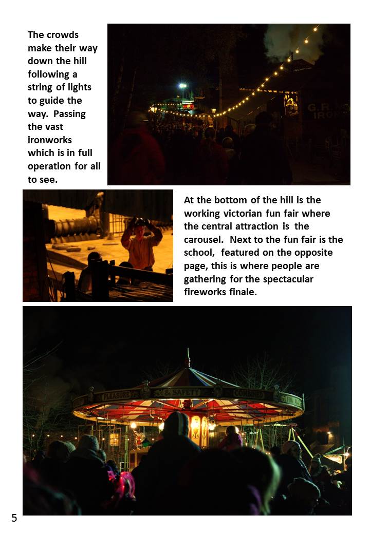

Pages 5 continues the story with a transitional walk from the industrial area down to the fun fair and school. The photo at the top of page 5 was a compromise between adding an element to the story and including a photograph that was more grainy due to the high ISO of 3200. Although not a great aesthetically pleasing photograph it shows the enormity of the crowds and the walking involved and gives the feeling of moving forward showing an action taking place. The second photo down on page 5 seems slightly out-of-place in between a crowd of people walking down a hill and the fun fair being at the bottom. It was included because it is what people would see as they were passing the big iron works which was situated on the hill. Having passed the ironworks the fun fair is at the bottom of the hill. The bottom photograph shows the crowds waiting for a ride on the carousel with is brightly lit and colourful and more aesthetically pleasing than the previous two photos.
Page six shows a crowd gathering in front of the school for the fireworks to begin. It’s a shame there is no indication of the building in the picture being a school but I included to show the symmetrical architecture of the time and to continue the story of the crowds waiting for the show.


I placed the two photos together on page 7 as they show a happy child watching the fireworks and we know he’s watching the fireworks by placing a firework in the sky with tops of heads on the same page. Page 8 is showing the showstopper final firework filling up the sky and putting an end to the event. The fact that it fills the whole page is suggesting the firework is big in the sky and the biggest fireworks are always at the end.
This concludes my notes that accompany my assignment 5 submission. A pdf copy of the brochure can be found here