The primary colours Red, Blue and Yellow have complimentary secondary colours Green, Orange and Violet as illustrated in the painters colour wheel below:
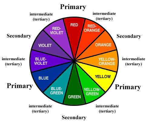
As you can see Reds complimentary opposite is Green, Blues is Orange and Yellow is Violet. There is also thought to be a correct ratio between these colour relationships:
Red and Green 1:1 as they are the same brightness
Orange and Blue 1:2 as orange is brighter than blue
Yellow and Violet 1:3 as yellow is far brighter than violet.
These ratios are used to give the correct balance of colour in a composition making it pleasing on the eye.
In addition to these complimentary relationships there are other colour relationship to take into consideration:
- Similar colours that lie next to each other on the colour wheel appear harmonious when combined with the correct ratio. These colours can also be broken up into warm and cool colours.
- Contrasting colours are two colours away from each other on the colour wheel. This combination isn’t considered to be harmonious but can be striking.
- Accent of Colour can be any of the previously mentioned combinations but the ratio is always the same. This has a small area of one colour on top of a frame full of another colour.
My aim is to produce four photographs of each type of colour relationship.
Complimentary Colours
Photograph 1: Orange and Blue 1:2

With the background being neutral the main two colours in this photo are blue and orange. With the cap and eyes pointing downwards bringing the addition blue shoulders into composition the colours have a correct ratio of 1 orange : 2 blue. Without the addition of orange in this photo the blue against the neutral background would be quite flat but with it the orange adds depth. As a photograph this portrait captures a young boy taking a moment in thought which is a rare sight at that age. With the smile being visible it gives a happy feel to the overall image.

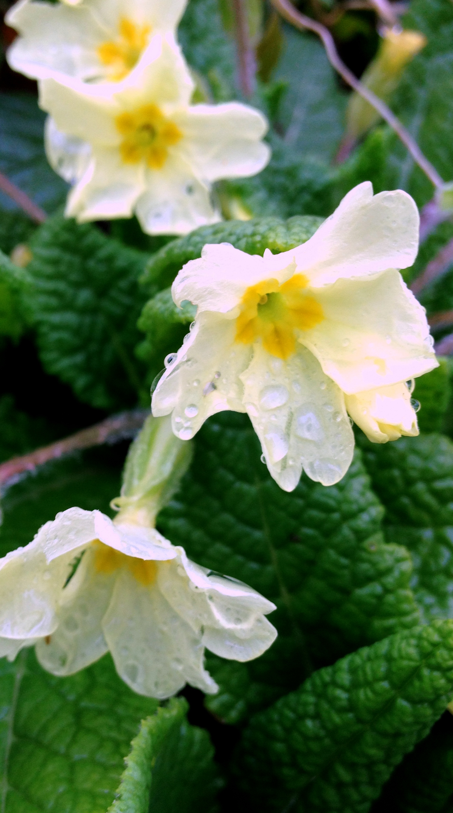
Photograph 2: Yellow and Violet 1:3

My aim here was to try to eliminate as much as the background colour, in this case green, to achieve a ratio of yellow 1 : violet 3. Yellow being the highest warm colour against a cool violet to balances out the arrangement in the frame to give a sence of harmony between the two. This photo was cropped to cut out some of the yellow so as not to overload the photo with too much brightness. By highlighting the yellow portions below you can see an uneven pattern has formed which allows the eye to flow around the photo giving quite a lot of movement to the composition. Although flowers are one of my favorite subjects because of their abundance of colour this photograph is pleasing to me as there is a carpet of flowers with one flower reaching out more than the others giving a focal point.

Photograph 3 : 1 Red : 1 Green

I happened upon this combination of Red and Green whilst visiting a museum. I was on the lookout for certain colour combinations and this seemed to have quite vivid shades of red and green. By creating a tight frame I was able to include the correct amount of red to balance it with the same amount of green. What I like about this image is that although the red is separated by the green the shape of the metal points down to the green portion and then more implied vertical lines down to the remaining red making your eye take in the entire amount of colour in one swoop. As a photograph it seems pleasing on the eye albeit not the most interesting photo but fits the brief of colour partnership and ratio perfectly.

Photograph 4
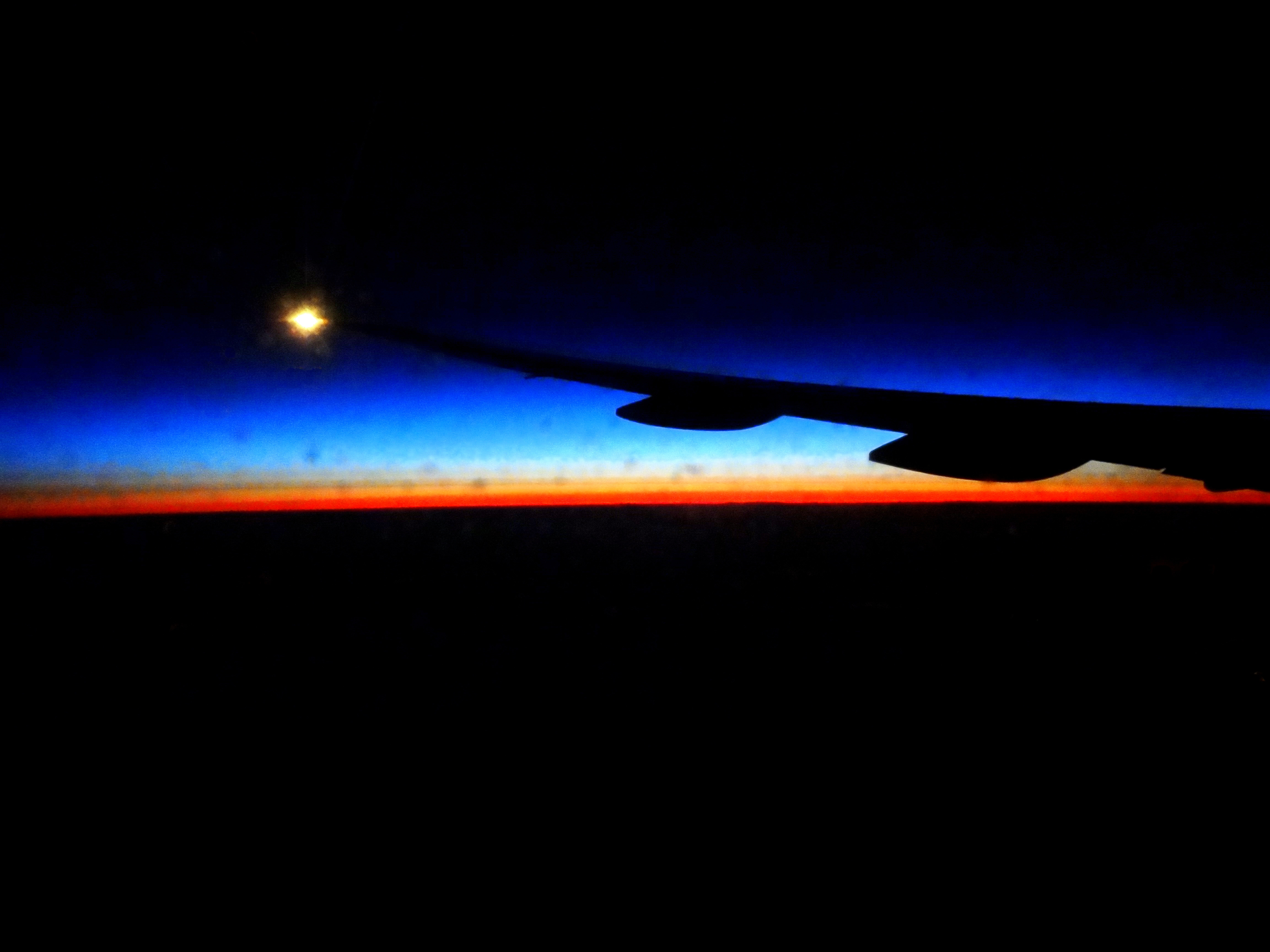
This isn’t a high quality image as it was taken through an aeroplane window on a flight from Dubai to Brisbane. During this flight as you’re chasing the night and in darkness for 14 hours. Eventually the sun breaks over the horizon and you’re blessed with this natural colour spectacular. Having now studied colour in photographs I understand why this image is so pleasing. Not only does it encompass the blue and orange complimentary relationship it also has the correct ratio of the two colours being 1 orange : 3 blue. The horizon line draws your eye across it and back out through the silhouette of the wing to the light at the end giving movement. Below you can see a graphic of the colour ratios and how movement has been created. I toyed with the idea of this photograph being within the colour accent category as the colour is a small proportion of the entire frame but I decided against it as it contains two harmonious colours in between a silhouette.

Similar Colours
Photograph one: Green, Blue and Violet (Cool)

What attracted me to photograph this flower in the first instance was the lovely deep violet colour with the quite contrasting green buds and some of the background. After uploading the image file for editing I noticed the nice blue blurred out background which seemed to harmonise the violet and green. I like this combination of colours and feel that they compliment each other very well. This image has depth with a narrow depth of field making the flower stand out from the background.

Photograph two: Orange and Yellow (Warm)

When looking inside a flower it opens up a whole new world. What may not have been obvious to the naked eye are these circles of yellow petals within the orange flower. The inner part of the flower has more yellow than orange but the outer orange petals even out the balance of brightness giving a pleasing combination and ratio of colours. Also within this flower are different types of implied patterns. The darker inner circle has lots of tiny buds making quite and even pattern. There are implied circles of yellow and orange petals. Then the outer petals imply different types of lines all pointing in towards the circles.

Photograph three: Green, Blue and Violet (cool)

This photograph has all the three cool colours on the colour wheel which work in harmony when altogether. The addition of the yellow bits works well because they are placed within their complimentary opposite of violet. When planning this photograph I wanted to include as much green as possible to make the violet flowers less prominent but somehow it didn’t work that well. My son was standing nearby wearing a blue scarf so I asked him to smell the flowers to see if the blue scarf added anything to the frame. I was pleased with the results as the blue scarf added balance to green and violet. As in my other photograph of crocuses there appears to be a random pattern formed with the flowers but in this instance movement is created with direction of my sons face pointing towards the focal point.

Photograph Four: Green and Yellow
I have never considered putting yellow and green together before but it’s a common relationship in nature. Green and yellow sit next to each other on the colour wheel as green shares some of the yellows properties. This combination has more of an edge as it crosses the cool\warm boundary by placing one colour from each side into the frame. This colour combination is harmonious and easy on the eye. As a photograph that was taken on wet spring it has a nice composition although the twig in the top right corner can be distracting. Having multiple points within the frame makes the eye look at the whole photograph eventually settling on the biggest flower facing the lens.

Colour contrast through contrasting colours
Photograph 1: Green and Orange

Every morning my dog hunts for the only bit of sun that enters our cottage. It’s normally on the end of the bed but on this day she decided to perch awkwardly on the head of the sofa. When I saw her and noticed how the light had caught one of her eyes and shadowed the other I reached for my camera so as not to disturb her. I then noticed how the light was on her proudly crossed legs as she eased into a comfortable position in the sun. I then noticed the silhouette of the window frame and the vase of flowers placed nearby. And there it was quite a nice portrait of my dog in a natural pose with interesting light and neutral background. My intention was to upload the photos, edit them and convert them to black and white. However when viewed on the computer screen I noticed the contrast in the colours of the sofa and wall being green and orange. In this instance I think the colours work really well together creating an interesting and eye-catching photograph. Also the slant of the light through the window pointing directly towards the dogs adds movement to the photo especially as the dog is then looking directly into the camera. It’s as if the flow of light is visual in its path from outside and into the camera.

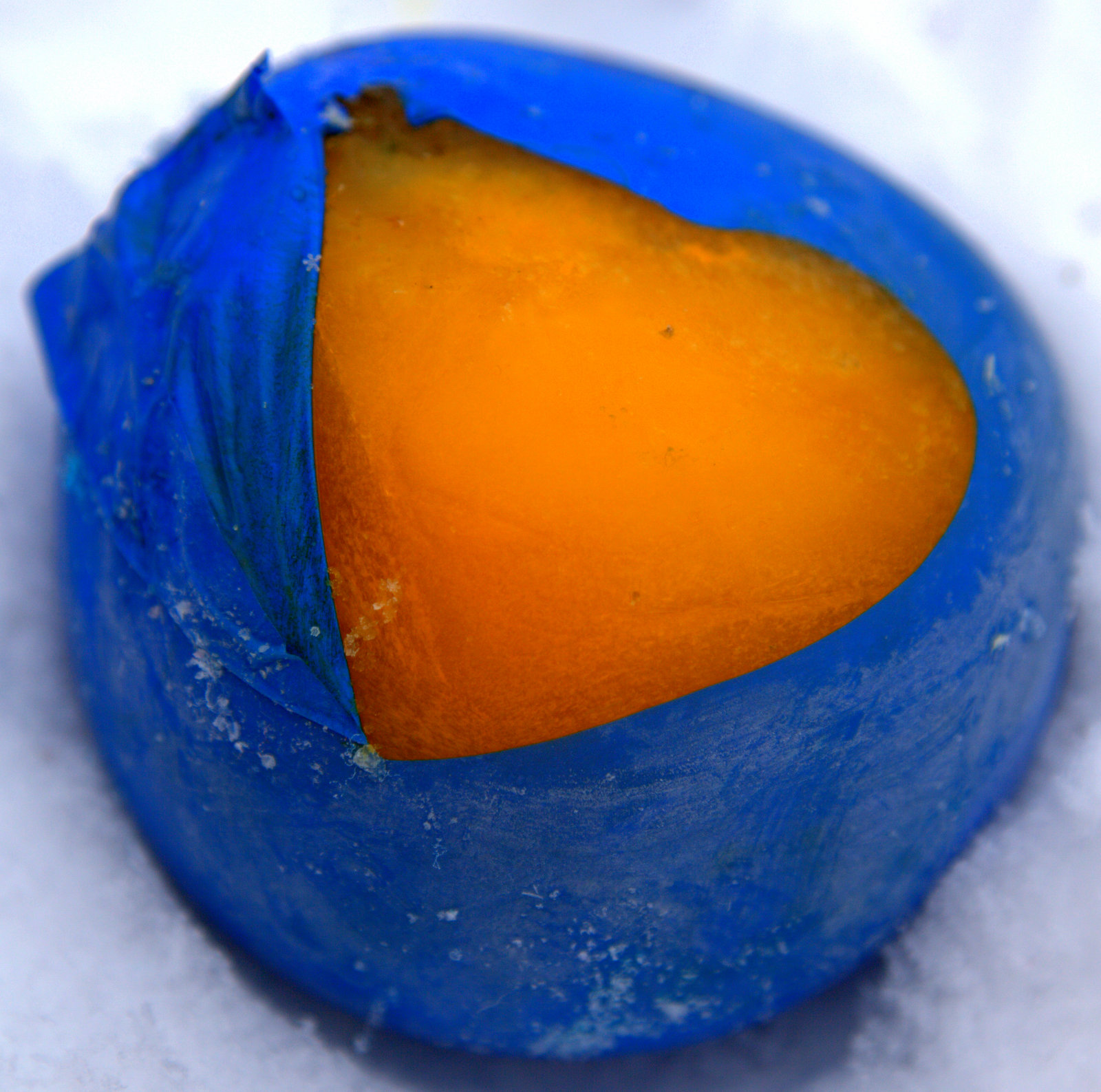
Photograph 2: Red and Blue

The colours in this photograph are highly contrasting. The brighter blue sky in the background accentuates the deeper blue and red of the rollercoaster tracks. The ratio seems to be fairly accurate with less red being the brighter of the two to create an interesting photo. The strategic placing of the camera was deliberate beneath the two upward pointing triangles to give a sense of height and to steer the eyes towards and along the track.

Photograph 3: Green and Violet

The lavender in this photo shows a curve of violet leading your eye from front to back. The contrast in colours in dramatic but one that works well. The ratio of green to violet is approximately 1 Green : 2 violet which is good considering green is brighter than violet.

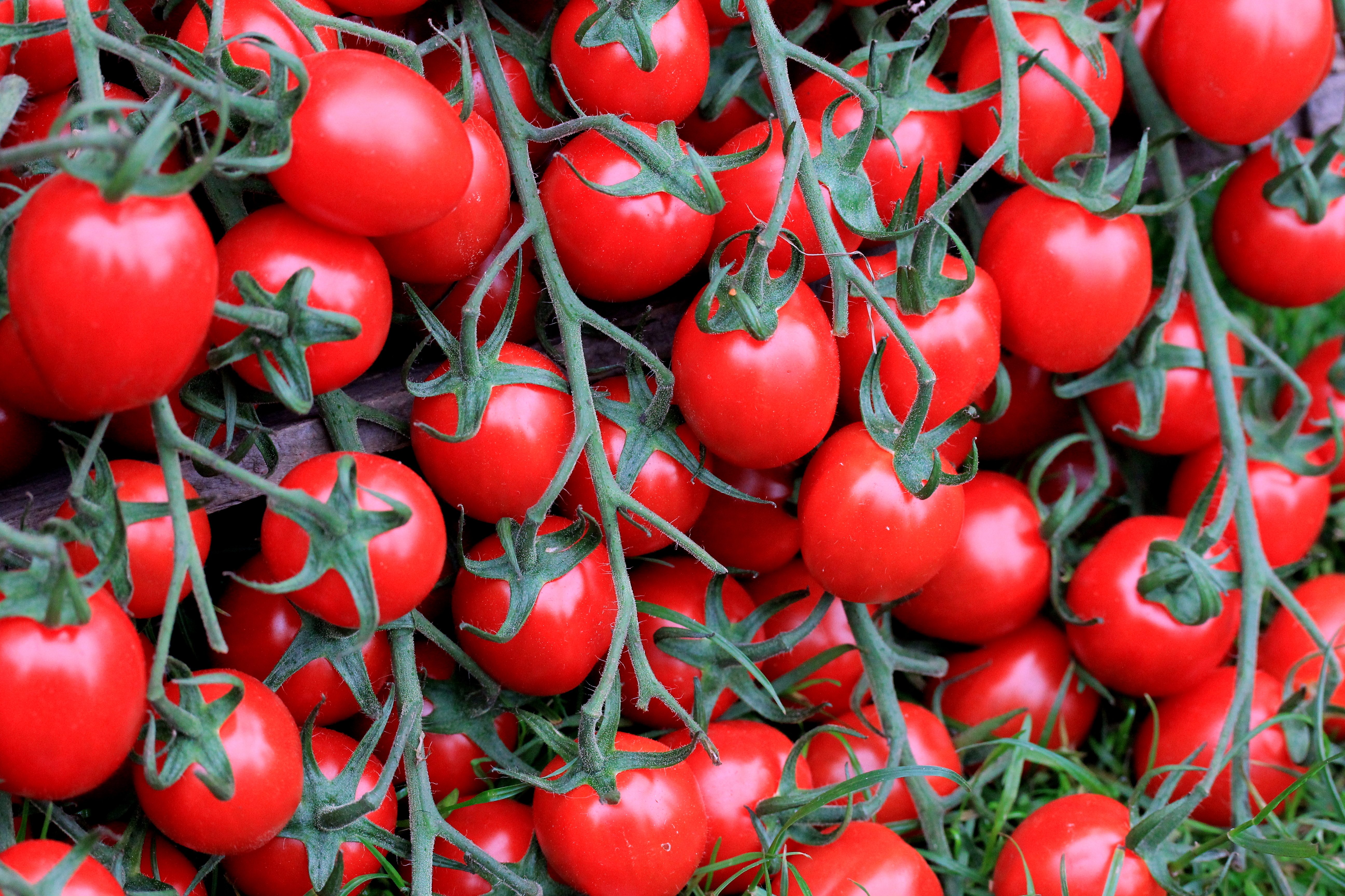
Photograph 4: Red and Blue

This still life image was created with blue hair gel and red tomatoes with a view to create a dramatic contrast in colours and textures. I mounted my camera onto a tripod to enable me to be more exact about the composition. The gel and tomatoes were placed in a glass dish and lit from underneath to create an illuminating effect. Also some tomato slices were placed underneath the gel to add some depth to the image making this still life less static. The underneath illumination is making the blue brighter and therefore reaching quite a good balance of the two colours when combined.
Colour Accent
Photograph 1:

The red light against the bright blue sky is quite eye-catching. The light is like a statement peace within the frame which your eye is drawn to immediately. With the red being bright coupled with the fact that it’s a light it stands out enough on its own to make a pleasing accent of colour. The lamp-post leads a line down towards the basket catchers and the blue outline of them compliments the sky. Because the lamppost is in the top right of the frame and the baskets in the bottom left I feel that this gives a nice balance to the composition.

Photograph 2:

This still life was setup to capture an accent of colour. I chose Blue for the background colour and yellow for the colour accent because I thought they would not only contrast each other but would also be an interesting and striking combination. With the camera mounted on a tripod and using a 100mm macro lens I set about composing a pleasing arrangement. Using m & m’s I firstly wanted to ensure the m logo wasn’t visible on any of the sweets as I thought this would be distracting. Then I arranged perfect lines within a square to create a neat pattern in which to lead the eye to and from the accent of colour. I tried the yellow m & m in various points within the frame but found this to be the most pleasing and less static.

Photograph 3:

When preparing this shot I had to wait quite a while for the red boat to enter the frame sa as to eliminate all the distractions that were present. I wanted the red boat to dominate the frame with its bright colour against a sea of blue, background and sky. I also want to add movement to the photo and with the addition of another point is the frame i.e. the white boat, this has been achieved.

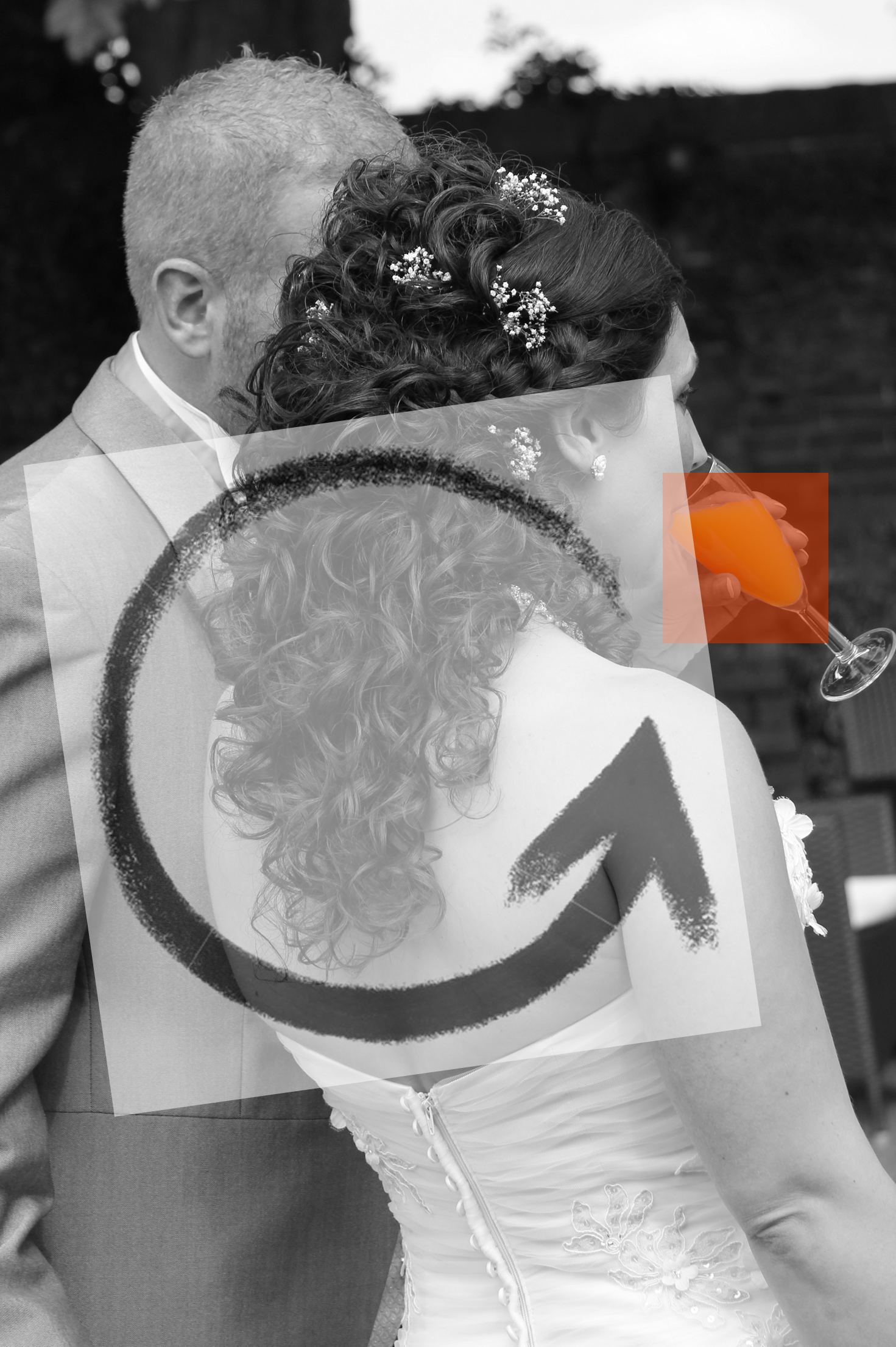
Photograph 4:

When I think of colour accent I also think of colour popping which is why I’ve added an example in this section. In particular I chose this composition where the colour accent is close to the edge and your eye is directed straight to it. Your eye is then led away from the colour accent to the face of the bride onto the groom and down towards the detail in the back of the dress. Although the colour accent is the focal point the eye is led all around the frame.
The above examples demonstrate the effectiveness of using colour rules when composing images. By using the basic rule of combining the opposite colours on the colour wheel harmony can be achieved. On the other end of the scale is colour contrast where although harmony may not be achieved interesting and striking photos can be. I tend to lean more towards contrast as I like effect it adds to photographs that would otherwise be quite mundane.