My objective for this assignment is to identify five or six buildings and produce two to four images for each one. The main focus is in describing effectively and attractively the way in which these spaces are used.
The first task I undertook was to choose which buildings I would use. I was looking for variety of different types of buildings and differing uses for the spaces contained within them.
My selection are as follows:
- New cinema
- Old church
- Deli
- Museum for Children
- Historical Foundry
I wanted to photograph a library as my sixth selection but it was unexpectedly closed on the day I visited. I phoned the library to ask if photography was allowed but they said because children are normally present it wouldn’t be appropriate. For this reason I have kept my selection to five buildings so I can concentrate on them.
I devised a plan on how to achieve my objectives which can be found in my learning log:
https://wordpress.com/post/samjbennett.wordpress.com/1245
I will include some background information about each building and whether it is still used for its original purpose or not. I will also discuss whether, in my opinion, the space is effective as a usable space.
New Cinema
This cinema forms part of a new development in Telford, Southwater, which contains restaurants, bars and leisure facilities. The cinema is situated at the end of a row with it’s screens sitting above its adjoining restaurants. As a whole and in terms of the development this is a very efficient use of the space. As a cinema, the main foyer and the lobby are contained in what appears to be their own building with the screens leading off to one side. You don’t feel like you’re sitting above a restaurant, its simply an extension of the cinema itself.
My initial thoughts for photographing the cinema were to include the foyer, with ticket machines in view, the popcorn counter, the row of screen doors and view of the screen from the back of the cinema. This would encompass the complete ‘cinema experience’ within the allowed four photographs.
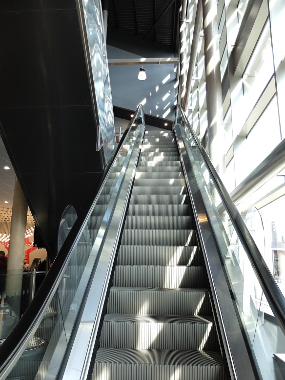
Then I thought more about the space within the cinema and how its used effectively which lead to my second arrangement which shows the flow of the space inside the cinema.
The foyer is quite a vast area that I wasn’t able to fit into one photograph so I decided to take two images from two different angle to show the different elements, photo 1 and photo 2. All the photographs here were taken at a standing position as this is the area you would walk through.
Photo 1
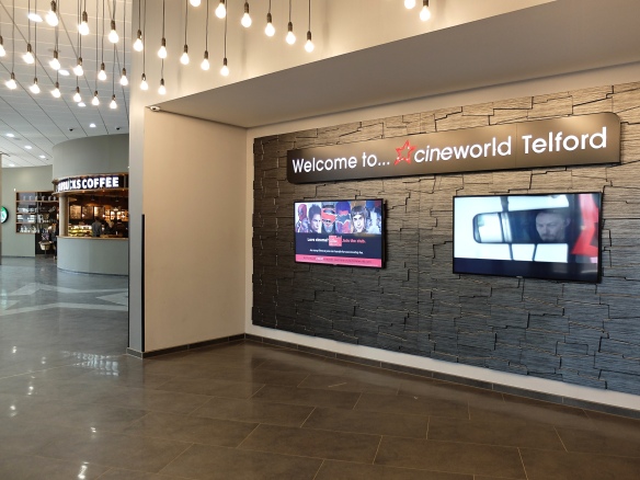
Photo 2

In the next photograph, photo 3 I wanted to describe two things, one being the suggestion of the space being on two levels and two, the amount of light that floods in from the incredibly tall windows. I also like this photograph asthetically with its leading lines, the scale of the height and the light making a pattern on the wall.
Photo 3
Photograph four shows the use of the space upstairs as the main lobby of the cinema, where snacks are purchased prior to moving on to your screen. I wasn’t allowed beyond this point, in fact from this point on, I wasn’t allowed to take any more photos.
Photo 4

Despite my shoot being cut short I think I captured the main uses of the space inside the cinema. Some elements of my final selected images I would do again, for instance, the little boy in the corner of photograph 4 is looking up at the animation but he appears to be looking out of the frame which is quite distracting.
In photos one and two I can’t decide if the tungsten light is unattractive or not. It’s a personal pet hate of mine although it seems to add some warmth in this situation which I feel is important to the space. Otherwise it appears quite cold with its steel structure and marble floors.
In terms of the space being effective I think in this case it works very well. The space is open and vast but defined by its uses. Where the foyer and main lobby is in it’s own building the rest of the cinema i.e. the screens are situated above the surrounding restaurants. It’s a clever way of ulitising the space available effectively and was designed to do exactly that. The design allows for lots of light to flood in exactly where it’s needed which also makes the space efficient.
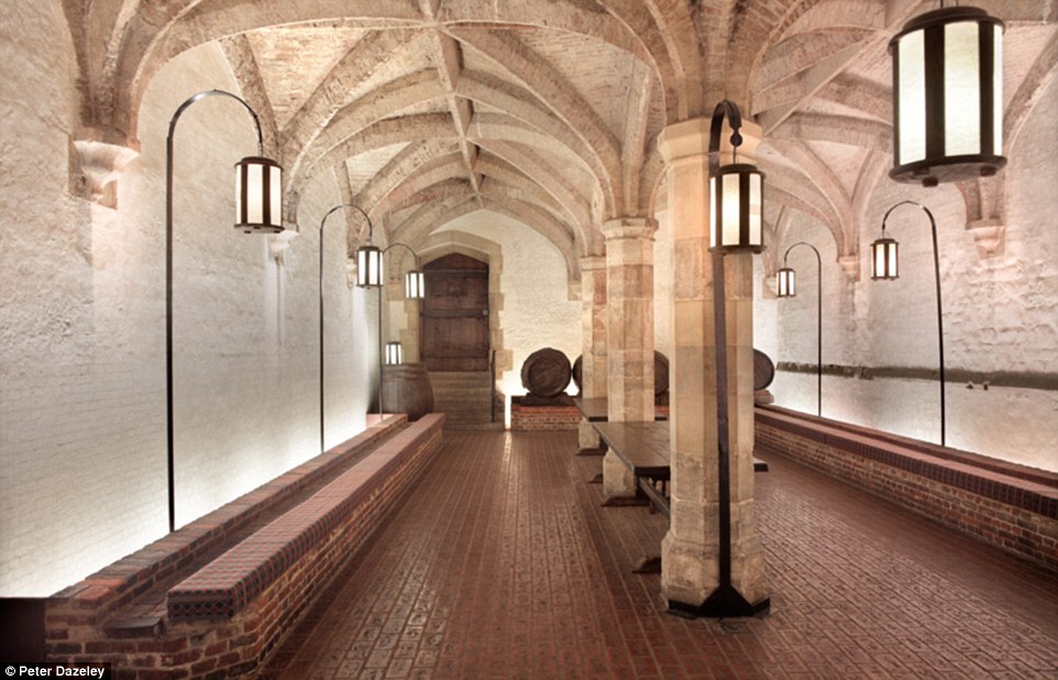
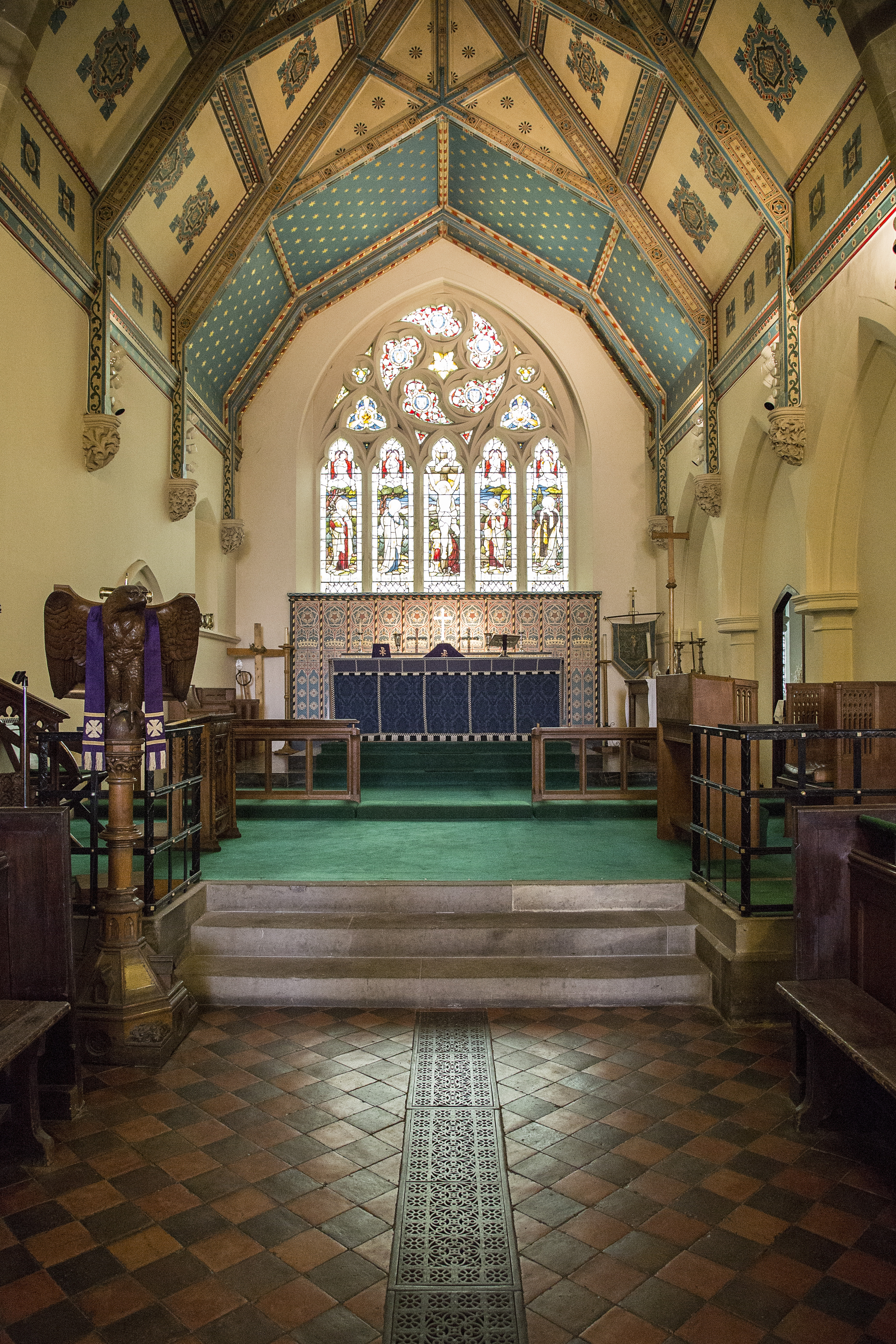
The Church
Our local church is quite picturesque, sitting at the top of a hill. I’m told churches were designed to be built on hills in those days so the villagers can see the clock and hear the bells easier from their houses. Another reason for building a church on a hill is it was beleived that you should bury your loved ones up high to be closer to god. However in this case the village sits on a flood plane which is no good for burials and therefore the cemetery needed to be up high so the church was built up the hill. If so much thought went into the outside space of the church then it stands to reason the the inside was lavished with the same consideration.
Holy Trinity Church in Coalbrookdale was built by the famous local Darby family and was completed in 1854. The Darby family came from generations of quakers but Abraham Darby IV left the Quaker belief behind for the more modern Anglican beliefs and donated money to the town to construct the church.
As churches are no longer left unlocked I found the contact details for the church warden and arranged to meet her there.
The usable space inside the church is as elaborate as the exterior of the building. The first sight upon entering the church is quite grand with a long aisle to walk down which is where you can also access the pews. I chose my viewpoints based on the flow of its users, almost like a walk through.
Photo 1
 The aisle leads you directly to the church alter with its stunning stained glass window in full view. The design of space inside the church is not only effective, it allows for incredibly beautiful views. This photograph was taken from a standing position as the user would be walking from this viewpoint.
Photo 2
Photograph 2 details the function of the space from the users viewpoint and in this instance a sitting position. As you can see the main uses of this area are visible to the users of the church from their seated positions, these being, the pulpit and the alter. Whilst showing the main uses, the space is attractive from every angle.
Photograph 3 shows a view of the approach to the alter from a standing position. I thought it was important to show a more detailed view of the alter as it is arguably the most important space in the church. We know this because of the elaborate stained glass window being the central point of focus with the alter sitting beneath it.
Photo 3
The reason for choosing this viewpoint is to include the steps up to the alter and how this is a great use of the space by elevating ‘the main event’ so the users maintain a good view. Also notice the beautiful ceiling which has a story of its own and detailed in my learning log.
Photo 4

Photograph 4 shows the reverse view of the church, facing the back wall. This view is equally as ornate albeit slight less elaborate. What is great about the back wall and an incredibly important design feature for the effectiveness of the use of the space is the amount of light that floods in through the huge window. The window is still ornate in design but contains plain glass to give light to the space.
In my opinion the use of this space works on so many levels, many already mentioned. The thought that has gone into the function of the space, how it can be fully utilised and the decorative quality; has been repaid in the fact this space is still used for its original purpose almost 160 years on without being changed.
So the previous two buildings were a contrast between old and new however both are still being used for their original intended use. The next building has changed it’s use several times and is currently a deli\cafe.
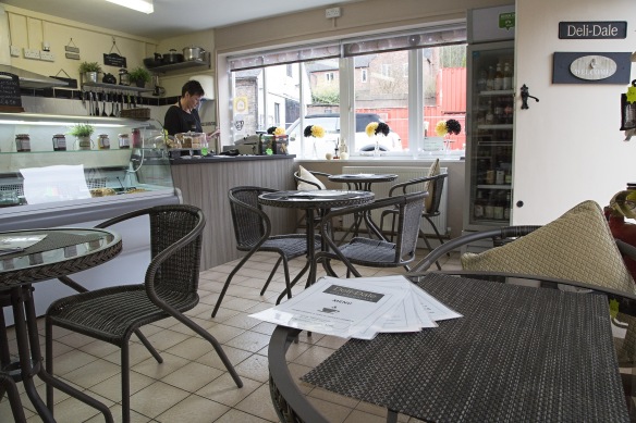
The Deli
The building was originally built as a ‘tuck shop’ which acted as a local newsagents come grocery store. The building was originally built from timber but due to severe flooding a brick building was erected to replace the damaged timber building. The brick building has been subjected to two severe floods since, one reaching the top of the front door. The damage was repaired and was reopened as a deli.
So, the building itself wasn’t built for a specific use however it was built to provide a space for a use to fit into.
Following my previous method of obtaining a description of the use of the space I achieved this by following the walkthrough of the user experience.
Photograph 1 shows the view on entry into the building and the customers first glance.
Photo 1
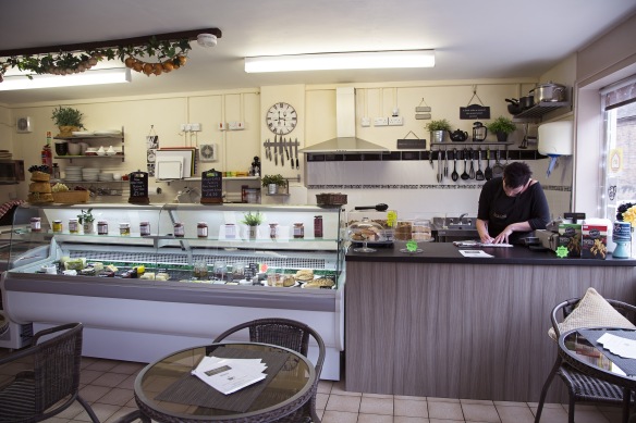
My first thought when entering this building was how do I make this space look attractive? Therefore I focussed photograph 1 on the main counter and cut out the more distracting items from the frame; such as, a tall fridge to the right and toilet to the right. If I want to make a space that food themed appear attractive then I don’t want a toilet door on view.
Photo 2

Photograph 2 shows a typical seating setup and the space around it which is limited. I think it’s important to point out the addition of the seating area outside that can be seen too. It shows that the space has been setup as a compromise between space for items for sale and space for enjoying purchases when considering its in a small space is a good way of utilising the space efficiently.
Photo 3
Photograph 3 is to demonstrate the viewpoint of the customer from a seated perspective. I opened the entry door to show the name of the establishment and also it obscured some less attire features.
Photo 4

I was intending to only use three photos from this set but I decided to add this final photograph to show the commercial part of the space used. It further demonstrates the compromise between sales space and customer space.
I think it’s good use of space however, on rainy days, when seating is needed indoors it would only take four sets of customers to fill the space which seems disproportionate to the goods and services available. Having said that I think its a cosy attractive space and in keeping with its intended use.
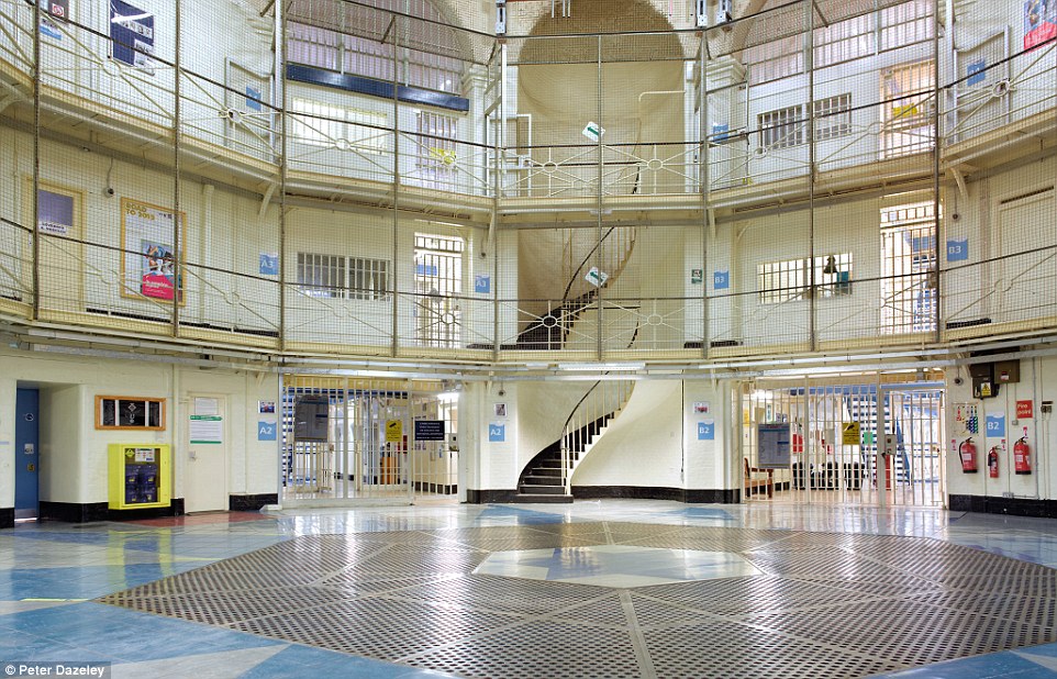
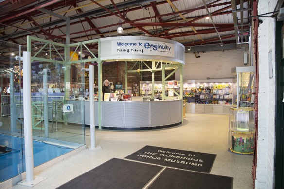
Museum for Children
I’m very pleased to have this building is my final selection because of it’s diversity compared to my other choices. The Museum on question is called ‘Enginuity’ and is situation in Coalbrookdale forming part of the Ironbridge Gorge Museums. This particular building was built **** and designed to house a fitting out shop for the adjoining foundry.
I was able to obtain a photo from the museum archives which is in my learning log (link at top of page).
Today the building is used as a museum to teach children about Engineering in exciting and interesting ways. Upon entry to the building is a reception desk and shop which is a logical first port of call for any visitors.
Photo 1
I thought it was important to demonstrate that the space still has an industrial feel by showing the steel structure of the roof. This is important because it links the old style of the building to the new.
Photo 2

This viewpoint allowed me to include as much of the space as possible and show the different activities and where they sit in the space. You can see the space is designed for visitors to flow from one activity to the other whilst making allowances for busy crowds.
Photo 3

This space has been defined as a rest area and whilst it sits within the same building some screening has been implemented to add to the comfort for visitors. Its a well thought out space and its notable that whilst screens have offered some respite its still very much part of the museum itself. Its a nice subtle addition to the use of the space.
Photo 4
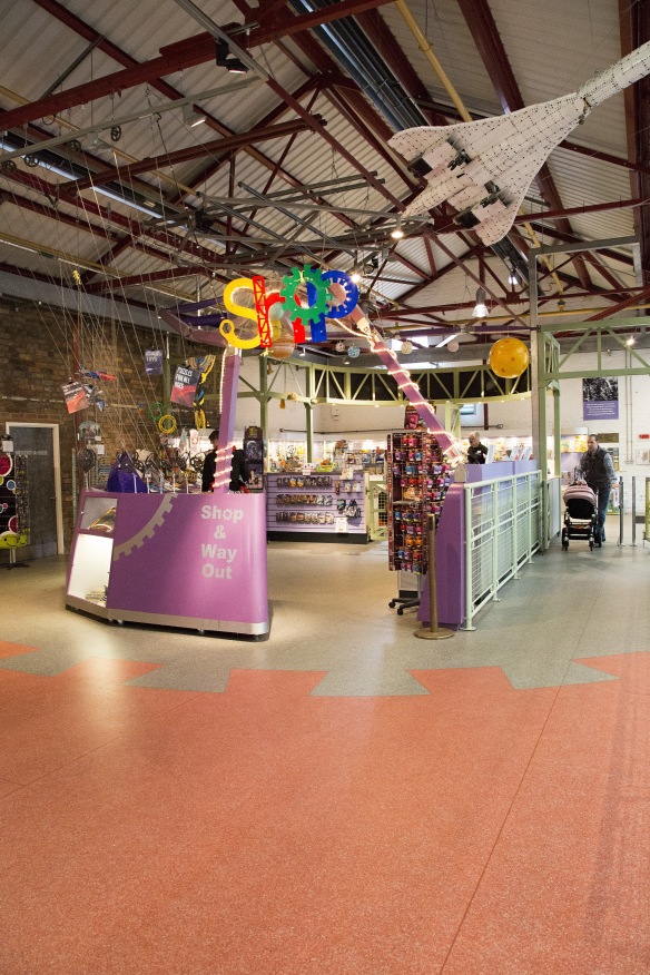
Of course at the end of any children experience theres merchandise on offer. I like the way this space has been encompassed and is less invasive to the rest of the museum. I decided to use a portrait frame to isolate the shop from its surroundings, demonstrating how its within but separate the rest of the space.
When the museums space was being designed they consulted with residents, schools and child services personnel to obtain ideas and opinions on how the space should be utilised and what goes into it. This collaboration approach has resulted in a well planned and thought out layout incorporating all the ideas into one space. I find this a very exciting concept by ‘recycling’ old buildings and creating new spaces.
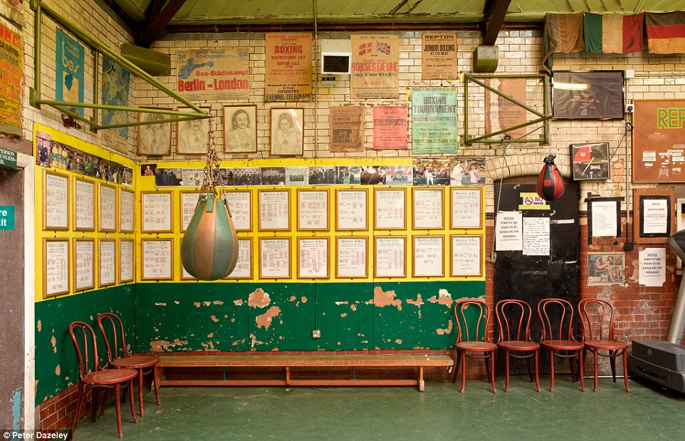
Historical Furnace
This furnace building wasn’t on my original list but when I saw it I thought it would be an interesting addition. This is the only building in my selection that has been built around it’s inside space. I find this to be an interesting concept and wondered how it would translate on photographs.
The building itself houses the remains of the water powered blast furnace where Abraham Darby I perfected the smelting of iron with coke instead of charcoal. A very important piece of history in the industrial revolution.
Obviously the furnace has been the subject of decay and to preserve it, a structure was built around it. The structure itself is a spectacle to be desired with it’s pyramid shape.
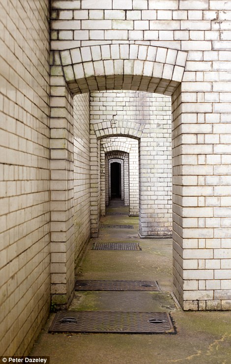
Photo 1
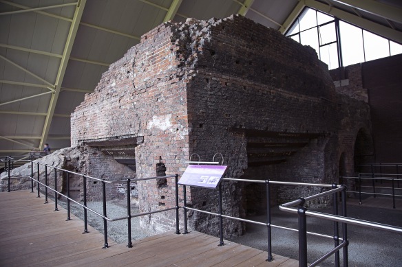
From this viewpoint the most complete part of the furnace is included. I tried to show part of its encasing too. The space around the furnace is quite limited although all that is needed is a walkway and this has been achieved. I felt it important to include an information point giving some clues as to the identity of the purpose of this space.
Photo 2

This perspective was created to give an identity to the use of the space including more signage and a visitor.
Photo 3
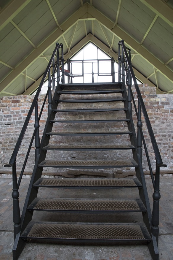
One thing this building was screaming out in it’s design is symmetry. In Photograph 3 I have tried to illustrate the use of symmetry whilst also demonstrating the use of levels to extend the visitor experience. These staircases increase the usable space available. I also find this is a pleasing image.
Photo 4

I don’t think a photographic description of this space would be complete without a view of the furnace chimney. It was difficult making this viewpoint an attractive photograph so I included some back and foreground to make it more interesting. I tried to capture just the top of the furnace but it translates as a photograph of bricks and had no meaning.
This building is a good use of space and designed in a way that no attended guidance is needed. It flows well and gives its visitors an easily accessible walk through experience. Ultimately the space was created to protect its occupant but has the added benefit of allowing people to visit this important monument.
In Conclusion
What did I learn from carrying out this assignment? It would be difficult to pin my learning experience down to one particular lesson as so many thought processes and tasks come out of shooting this assignment. The most important lesson in my opinion is to plan well for the shoot ahead. For example, researching the building cultivates ideas for how you want to portray the building. If a macabre building with a dark history was part of my selection then the style of photography would be much different to that of a children museum. It may even come down to the time of day or night you need to shoot depending on the lighting needed. I may have even photographed a spooky building at twilight but when I was arranging the church visit I wanted to make sure the sun was high in the sky so that light would come flooding from all sides of the church. If it was early morning then I could have ended up with too much light coming in one one side and darkness on the other as the sun would have been quite low. Another Important example is trying different viewpoints and putting yourself in shoes of the user.
I developed a method during the planning of this assignment and that was research, aim, plan, execute.
Research – researching the buildings I want to visit. What are they\were they used for. Do they have any significant history. This builds up a preconceived idea of how the shoot should take place and what kind of feel I’m going for. Is access available? should permission be obtained? Will I be able to shoot in that building? What equipment will I need?
Aim – thinking about what I want to shoot? how will I build up a story? Using the research to design a storyboard. Use different viewpoints to describe the space.
Plan – Putting the research and aims together and producing plan of action. Making contact with building managers? Creating a schedule of dates and times of shooting. Developing a list of actions to refer to on the shoot. Highlight things to try if others don’t work etc.
Execute – Carry out the shoot. Choose the best viewpoints to explain its use. Select images to be used. Write up.
When a photographer arrives for a shoot the perception is that they have simply picked up their camera bag and set off. Obviously I’ve demonstrated here that a lot of thought goes into research and planning before any shooting can take place.
What I have learnt above all else is that planning a shoot is equally as important as shooting itself. It’s not all about having the right equipment or choosing beautiful buildings or spaces. A lot of work goes into planning and its an important part of the process.

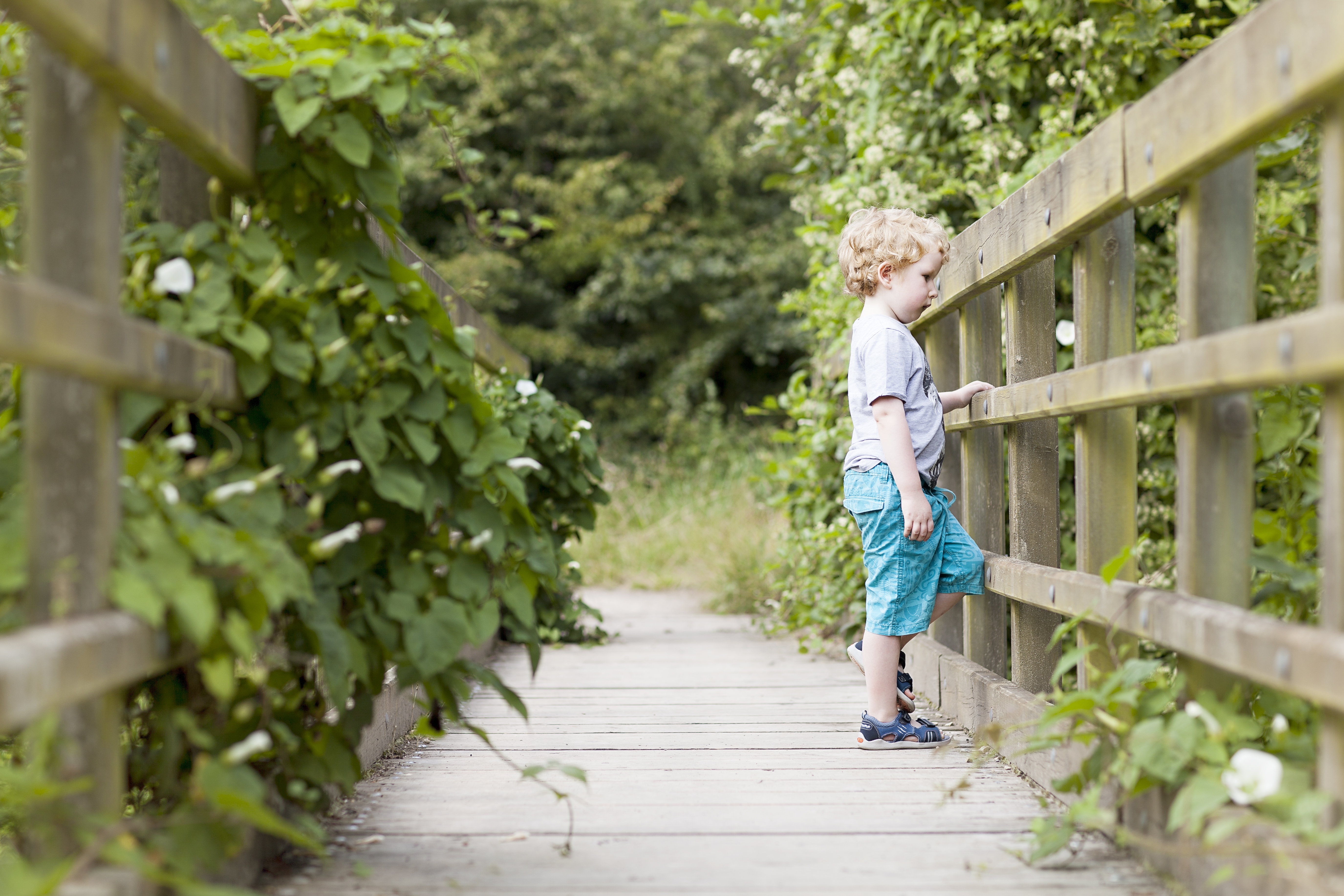

 I carried out a photo walk with my subject asking them to photograph what they saw and liked. He stopped to take a photograph of a puddle when I saw a reflection of him with a tree in the background and I thought it looked great. Whilst he was engrossed in his activity I took a photograph of his reflection. Although you can’t see much of his face I’m not shy of excluding faces from photographs. In fact this is my next personal project. So, that doesn’t bother me, its whether you can see that he’s taking photographs and carrying out an activity that I’m not sure of. I know he’s taking photos and my brain tells me that he has a camera in his hand but I’m not sure it’s clear to people who don’t know. I also like the colouring that’s reflected back, especially the blue of the sky.